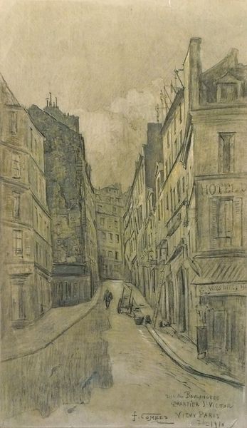
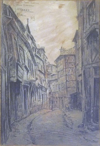
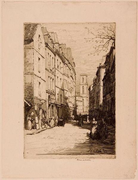
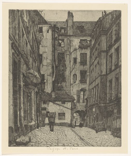
Paris, Carrefour Près Saint Germain Des Prés, des rues de l'Abbaye, Cardinal Lemoine, de Bourbon le Château, et de l'Echaudé St Germain 1910
0:00
0:00
drawing, ink
#
drawing
#
ink
#
cityscape
#
modernism
Dimensions: 40 x 24 cm
Copyright: Public domain
Editor: This is Fernand Combes' 1910 ink drawing, "Paris, Carrefour Près Saint Germain Des Prés." The linear precision is striking, and despite being a cityscape, it feels incredibly intimate, almost like peering into a forgotten corner of Parisian life. What draws your eye in this piece? Curator: My focus immediately goes to the deployment of line. Notice how the artist uses hatching and cross-hatching not just to depict form but also to structure the entire composition. It's a web of interconnected strokes that create a sense of depth and volume. Do you observe any particular lines that serve as anchoring points for your gaze? Editor: I think the sharper, darker lines that outline the central building, especially the awning and windows, really ground the image. It contrasts with the more delicate lines used for the buildings further back, creating depth, I think. Curator: Precisely. The density of lines directly correlates with the perceived proximity of objects. Consider also how the lines aren't merely descriptive but also performative. The varying pressure applied to the pen creates a rhythmic quality. What feeling do you get from this rhythm? Editor: It's like a visual pulse, almost like the city itself is breathing. I also like how the sketch feels unfinished, adding a sense of temporality, as if capturing a fleeting moment in time. Curator: Yes, the unfinished quality can be seen as an aesthetic choice. The artist isn’t trying to mimic reality; they’re presenting a structured interpretation. We could discuss the relationship between the weight of the lines and implied spatial dimensions too, it's remarkable. Do you see the composition's structure as contributing to that sense of dynamism? Editor: It definitely seems like the buildings leaning in and the slightly skewed perspective create that energetic feeling. I'm understanding more how the simple lines generate this sensation. Curator: Indeed. By looking at these relationships of the artwork elements to each other, rather than the artwork as representing something external, we get at the heart of Combes' skill. Editor: That's helpful. It reframes how to view art; seeing not just *what* it depicts but *how* it depicts it is exciting.
Comments
No comments
Be the first to comment and join the conversation on the ultimate creative platform.
More like this