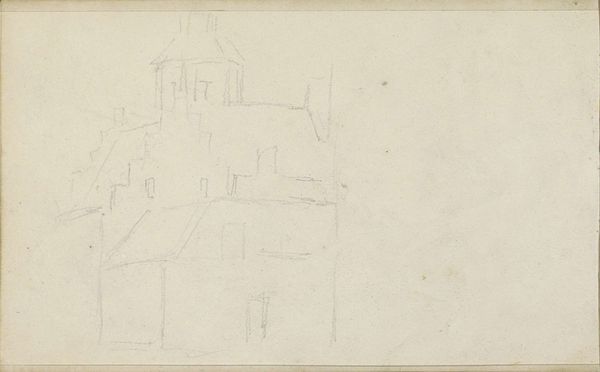
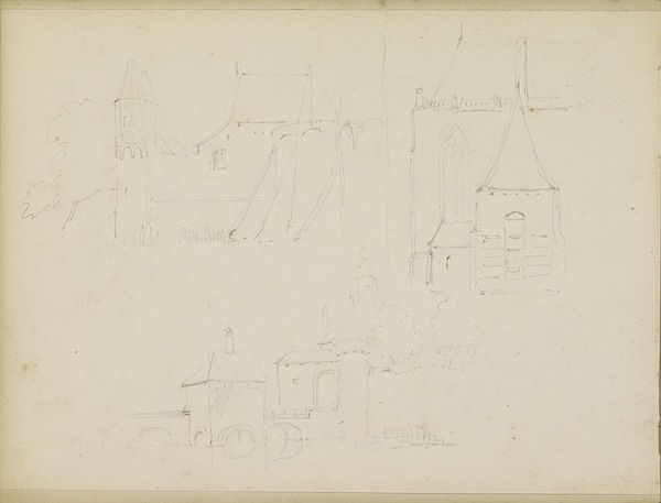
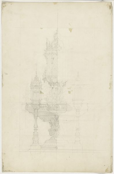
drawing, paper, pencil, architecture
#
drawing
#
medieval
#
pencil sketch
#
landscape
#
paper
#
geometric
#
pencil
#
line
#
architecture
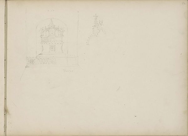
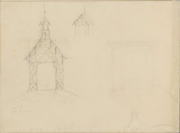
Dimensions: height 152 mm, width 201 mm
Copyright: Rijks Museum: Open Domain
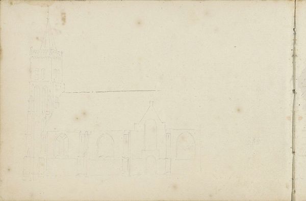
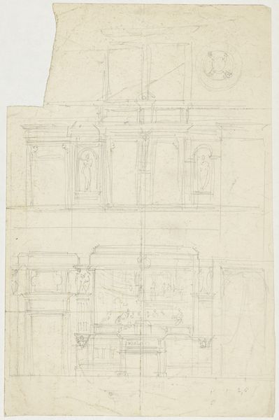
Curator: Welcome. We’re looking at Jan Abrahamsz. Beerstraten’s 17th-century pencil drawing, "Bovenste geleding en spits van een gothische kerktoren," or "Upper Member and Spire of a Gothic Church Tower". What strikes you first about this work? Editor: The ephemeral nature of the pencil on paper—it's a study in transience. The geometric lines feel hesitant, provisional; it gives the whole structure a delicate, almost ghostly, quality. You feel the artist exploring the essence of the spire through very simple means. Curator: Absolutely. The linearity is crucial. Observe how Beerstraten delineates the architectural form with a stark economy of lines. The repetitive arches rhythmically ascend, culminating in the pointed spire, creating a clear visual hierarchy. It directs our gaze upward, instilling a sense of awe—a quality integral to Gothic architecture itself. Editor: The Gothic style and pencil rendering reflect an interesting tension. The labor involved in the stone carving required to create that spire contrasts with the relative ease of Beerstraten’s sketching technique. One speaks of permanence and monumental labor, the other of speed and perhaps commissioned drawings on paper. Curator: Yes, the rapid execution speaks volumes. But look closely—note how the seemingly simple lines articulate complex spatial relationships. There’s an undeniable focus on the geometric framework. I also note, the paper itself contributes: its delicate weave almost emulates a cloudy background to suggest atmospheric perspective. Editor: I'm considering also what this paper would have cost in the 17th century; not something to be wasted. Beerstraten must have considered the economics as much as the aesthetic of such studies. There’s an entire material culture embedded in this relatively sparse sketch. Curator: It certainly reminds us of the layers of craftsmanship in what might seem a simple sketch, as the materiality connects this drawing to the grand Gothic structure it represents. Thank you. Editor: An insightful convergence of geometry, labour, and medium.
Comments
No comments
Be the first to comment and join the conversation on the ultimate creative platform.
More like this