drawing, print, ink, engraving
#
drawing
#
baroque
#
pen drawing
# print
#
pen sketch
#
old engraving style
#
form
#
personal sketchbook
#
ink
#
ink drawing experimentation
#
geometric
#
pen-ink sketch
#
line
#
pen work
#
sketchbook drawing
#
decorative-art
#
sketchbook art
#
engraving
#
doodle art
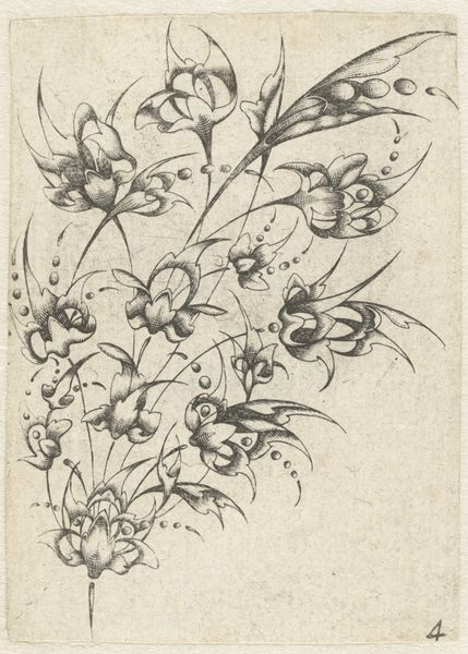
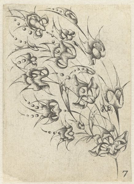
Dimensions: height 110 mm, width 119 mm
Copyright: Rijks Museum: Open Domain
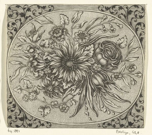
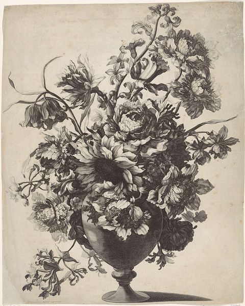
Curator: Johann Conrad Reuttimann's "Rozet van bloemen," created sometime before 1724, presents us with a captivating example of baroque floral design, rendered in ink as an engraving. It strikes me first by how densely packed and detailed it is, quite opulent. Editor: Yes, and notice how the rigidity of geometry interacts with organic forms in a surprisingly dynamic way. It has a certain graphic power typical of that period. The use of symmetry speaks to order but the overall feeling is lively, bordering on wild. What's your reading of that dichotomy? Curator: Floral rosettes were often understood as emblems of paradise or symbols of the Virgin Mary's purity. The circular arrangement, often used in rose windows of cathedrals, channels divine geometry. Reuttimann seems to tap into this rich well of visual symbolism. The inclusion of an insect is also compelling here: often read as memento mori and vanity, adding to this layer of contemplation. Editor: And in considering its possible political or social context, floral arrangements were deeply entwined with status, often featured on fabrics for garments meant to represent and differentiate rank. But what strikes me is its possible use as an artist's personal notebook. Perhaps these floral renderings were templates or sketches for future commissions, thereby positioning them more as active labor than the end of an expressive performance? Curator: It could certainly function on both levels simultaneously, don’t you think? Both acting as a sketch of the everyday, and containing the symbolic load so embedded within the visual language of the era. Also note the sharp lines created by the ink, almost appearing like intricate lace patterns. These sharp juxtapositions speak to both refinement, beauty, and, ultimately, its artificial creation and re-creation. Editor: Absolutely. And, circling back, those contrasting notions can inform our present-day ideas about natural conservation and what it means to depict natural beauty as an ideal. The density of line, as you point out, almost removes any connection to the real object, which is especially important if we begin considering notions of "nature" as intrinsically raced, classed, gendered, and so on. The image is ripe for our times. Curator: It seems a relatively unassuming doodle transforms into a meditation on life, beauty, and our inescapable mortality. Its layered iconography echoes in every line, offering an endless dialogue. Editor: A fruitful exploration indeed; this flower has unexpectedly thorny edges.
Comments
No comments
Be the first to comment and join the conversation on the ultimate creative platform.
More like this