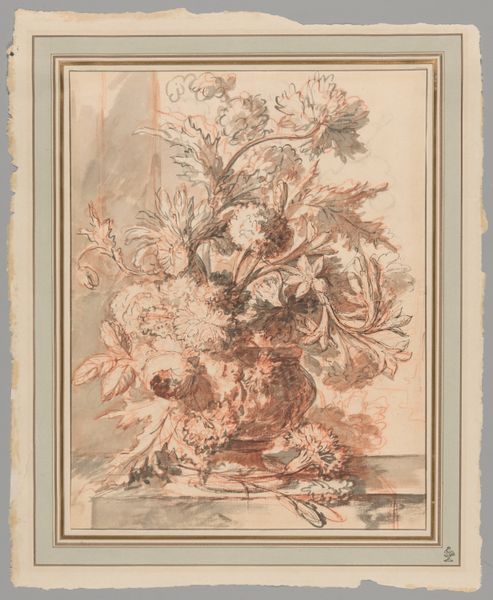
drawing, paper, pencil
#
drawing
#
neoclassicism
#
paper
#
pencil
#
watercolor
Dimensions: height 312 mm, width 210 mm
Copyright: Rijks Museum: Open Domain
Curator: This is “A Vase with Flowers in a Niche” by Gerard van Spaendonck, dating from the period of 1756 to 1822. It's rendered in pencil and watercolor on paper and belongs to the Neoclassical style. Editor: It’s… monochromatic in the softest way possible. The flowers practically ghost out of the niche they're set within. I wonder about this conscious restriction of palette – there's an austerity, a restraint that clashes wonderfully with the florid subject matter. Curator: Precisely! Spaendonck, like many artists of his era, was deeply interested in the symbolic language of flowers. Each bloom held a specific meaning, contributing to a deeper narrative beyond just aesthetics. Roses, of course, symbolize love, but the presence of certain other blossoms would further modify its sentiment. Editor: And there's an interesting contrast in the way he renders those roses! The blooms bursting from the vase have this ethereal, almost blurry quality. But down near the bottom of the niche there are some tighter blooms and loose petals strewn that feel more precisely rendered, like tiny poems in and of themselves. A juxtaposition. Curator: It highlights the temporal aspect often inherent in floral still lifes: beauty in decay, growth alongside decline, memento mori that gently hints at the fleeting nature of beauty and life itself, set against the enduring quality of the Neoclassical style, so fixated on lasting artistic legacies. Editor: Do you think the monochrome is tied into that, in a way? Color shouts, but gentle gradients like these feel timeless, quietly persistent through centuries. It is interesting, because I have always perceived paintings of flowers, a natural still life, to have to be as colorfull as can be. But this drawing opens different perspectives. It asks to contemplate and reflect more. Curator: That muted palette certainly contributes to a sense of timelessness and also elevates the formal quality, almost transforming it into an emblem—a study in form and shadow, rather than pure sensory indulgence. The choice is compelling and moves this work beyond being a mere beautiful object, doesn’t it? Editor: Absolutely! I love how even with the limited color scheme it feels full of emotions. You know what? Looking at the drawing once again I understand more the meaning. A bloom doesn’t necessarily have to be vibrant. This piece demonstrates it pretty well. Curator: Indeed. I see something new each time.
Comments
No comments
Be the first to comment and join the conversation on the ultimate creative platform.
More like this