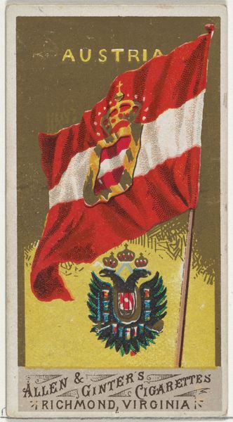
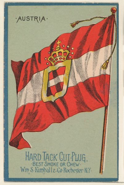
Grand Duchy of Luxemburg, from Flags of All Nations, Series 2 (N10) for Allen & Ginter Cigarettes Brands 1890
0:00
0:00
drawing, graphic-art, lithograph, print
#
drawing
#
graphic-art
#
lithograph
# print
#
miniature
Dimensions: Sheet: 2 3/4 x 1 1/2 in. (7 x 3.8 cm)
Copyright: Public Domain
Editor: This miniature lithograph from 1890, made by Allen & Ginter, showcases the flag of the Grand Duchy of Luxemburg. Its small size and the bold colors of the flag itself give it a sense of understated formality. What can you tell me about its visual structure? Curator: Observe how the composition is structured. The flag itself dominates the visual space, its horizontal bands of red, white, and blue establishing a clear tripartite division. The inclusion of the Luxembourg coat of arms—the red lion—introduces a vertical counterpoint that disrupts the flag's horizontality. Consider how the textured background, a seemingly random field, both contrasts with and highlights the precision of the flag's design. Does this background strike you as intentional or incidental? Editor: It looks intentional to me because the rough background and precise flag add an overall textural and tonal contrast that is visually appealing. The flat presentation gives a graphical directness, doesn't it? Curator: Precisely. The flatness, achieved through the lithographic process, denies any illusion of depth. This further emphasizes the graphic quality of the design. Focus on the formal relations at play: color, shape, line, and texture and you will continue to unveil new observations about its composition and effect. Editor: This has made me look more closely at the visual organization. Thanks! Curator: A close visual analysis is fundamental to its understanding, as every detail contributes to the aesthetic experience.
Comments
No comments
Be the first to comment and join the conversation on the ultimate creative platform.
More like this