Copyright: CC0 1.0
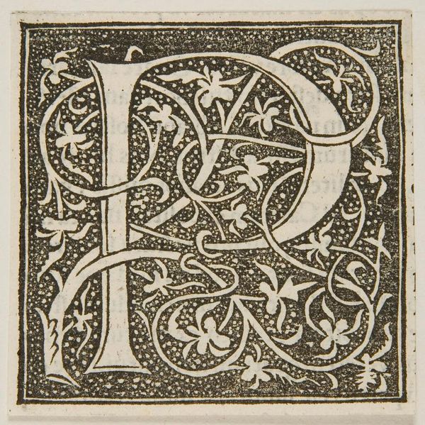
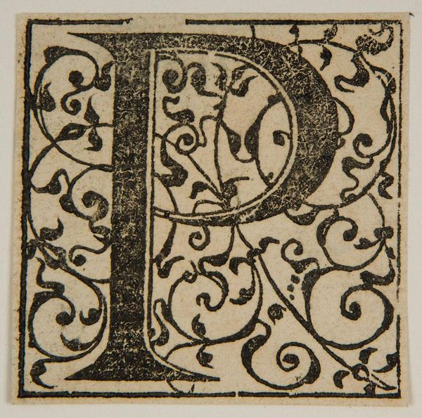
Editor: Here we have "Letter P" by an anonymous artist, and I’m struck by the contrast between the stark white letter and the densely patterned background. What visual elements stand out to you? Curator: Observe how the artist has utilized positive and negative space. The white 'P' establishes a clear form, yet the surrounding botanical motifs, rendered in black, vie for visual dominance. Do you see how the interplay of these elements creates tension? Editor: I do. It’s like the letter is fighting to emerge from the ornate design. Does the texture play a role? Curator: Indeed. The stippled background gives a tactile quality, enriching the overall composition. The linear contours of the letterform stand in stark contrast. Considering all, what have we learned? Editor: I see how the artist created visual tension and balance using form, texture, and the push and pull between positive and negative space. Thank you! Curator: A stimulating inquiry, focusing on the form itself.
Comments
No comments
Be the first to comment and join the conversation on the ultimate creative platform.
More like this