drawing, paper, ink
#
drawing
#
landscape
#
paper
#
ink
#
romanticism
#
genre-painting
#
watercolor
#
realism
Copyright: Rijks Museum: Open Domain
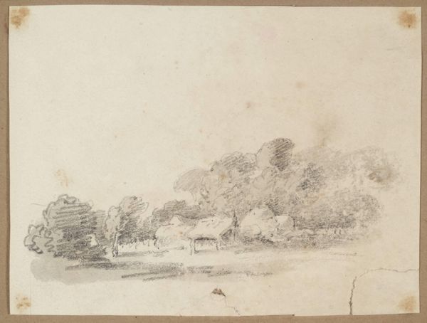
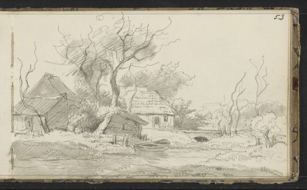
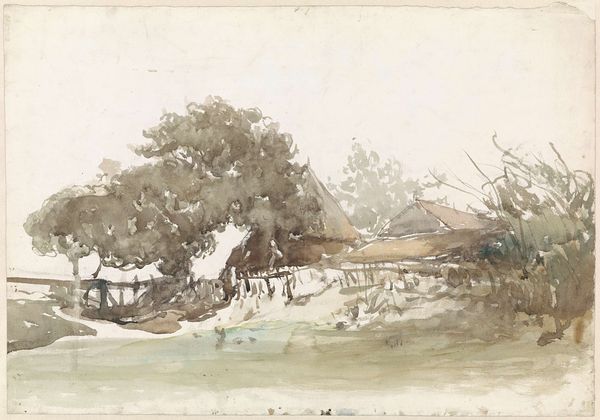
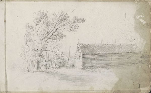
Curator: This drawing, held here at the Rijksmuseum, is titled "Landweg langs een boerderij in Kleef," or "Country Road by a Farm in Kleef," created in 1833 by Johannes Tavenraat. Editor: It’s intriguing how much atmosphere Tavenraat manages to conjure with so few lines. The washes of ink create a soft, almost dreamlike quality. Curator: Tavenraat captured something very specific, a longing for simpler times through genre painting within a romantic landscape style. Note the figures by the well—ordinary people depicted at rest but caught up within an ever-evolving pastoral tableau. The inclusion of travelers suggests a life unfolding over the horizon as the genre piece interacts with broader symbolism in the landscape, creating a sense of cyclical continuity. Editor: Yes, the subtle tonal shifts create a spatial depth that’s quite effective, with the ink wash on paper adding warmth, even evoking the passage of time. The trees, buildings, and figures all contribute to a pleasing distribution of values, too. There's a very organized sense of harmony even in the simple forms, a quietude or meditative sense enhanced by the sepia tone and broad values. Curator: Precisely, Kleef had cultural and psychological associations connected to an idealized vision of country life. This artwork encapsulates Dutch identity within a genre setting—it recalls a simpler time while offering glimpses of cultural memory around community and land, like echoes of village life. It could just be the style. However, for me, this hints at an ongoing national search and yearning for authentic community at the center of romanticism. Editor: I see what you mean; those rural buildings do provide an element of familiarity. Looking at it formally though, the realism is quite plain: almost documentary and certainly functional in tone, with the overall arrangement offering both balance and visual ease. It’s not quite striking in composition—that would require, perhaps, sharper contrast or use of light, but very, very easy on the eye. Curator: Indeed, for me it embodies an important vision tied into shared understanding—we all have cultural attachments here somehow within these ordinary scenes and figures set against an agrarian, Romantic tableau. Editor: For me it really draws us in through simplicity and soft tonal shifts: the artwork, the idea, the place, and the time. It's beautifully and effectively arranged to communicate that vision.
Comments
No comments
Be the first to comment and join the conversation on the ultimate creative platform.
More like this