drawing, print
#
drawing
#
comic strip sketch
#
aged paper
#
still-life-photography
#
narrative-art
# print
#
caricature
#
sketch book
#
personal journal design
#
figuration
#
personal sketchbook
#
idea generation sketch
#
sketchwork
#
comic
#
line
#
sketchbook drawing
#
storyboard and sketchbook work
#
sketchbook art
#
realism
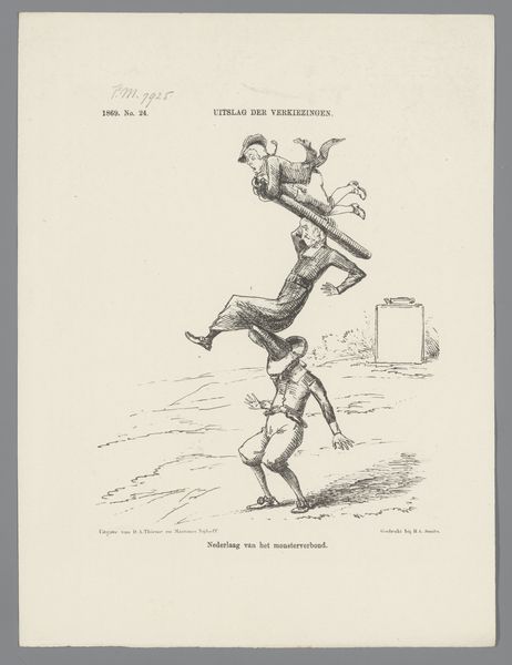
Dimensions: height 275 mm, width 215 mm
Copyright: Rijks Museum: Open Domain
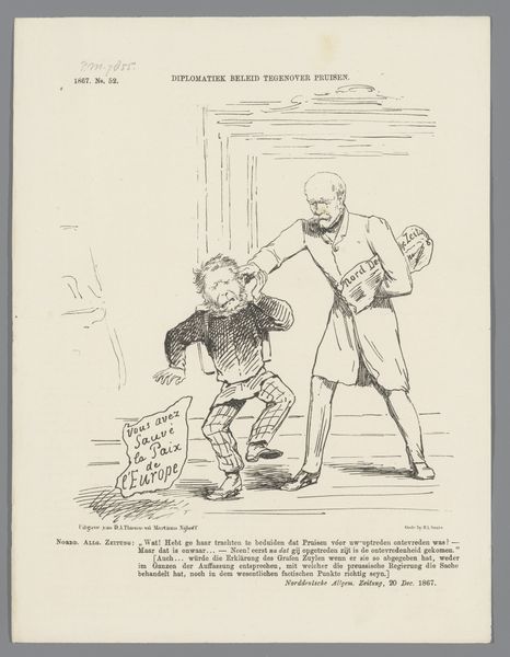
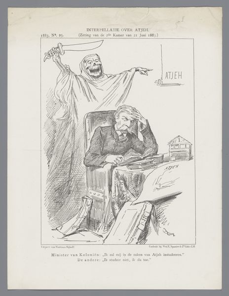
Editor: This is "Spotprent met Keuchenius en Schimmelpenninck," a print made in 1886. It has a very linear style, and a satirical feeling jumps right out at me. What strikes you first about this piece? Curator: The most compelling aspect is how the artist uses line to delineate form and express a specific narrative. Observe the contrast between the rigid, vertical lines composing the standing figure, and the more relaxed, curvilinear strokes used for the reclining one. It creates a clear visual hierarchy, no? Editor: Definitely. The standing figure is much more defined, while the one on the ground seems… well, less important. Is there a relationship between this visual contrast and the subject matter? Curator: Precisely. Note how the artist uses the varying density of the linework to create areas of light and shadow. Consider where the artist places the vanishing point and horizon line; what does that positioning communicate about the power dynamics within the scene? Editor: I see that the artist placed the vanishing point on the horizon to the right, seemingly aligning with the implied importance of the standing figure. It makes the reeclining figure seem so much less relevant. Also, how the composition itself directs our eyes... fascinating! Curator: Indeed. The strategic deployment of visual elements—line, form, composition—conspire to communicate an ideological position. Now, what does it reveal about society, power, and image-making? Editor: Wow, it's incredible to consider how formal elements contribute to conveying such rich information, even without considering any historical context. Thanks! Curator: My pleasure. Keep looking.
Comments
No comments
Be the first to comment and join the conversation on the ultimate creative platform.
More like this