About this artwork
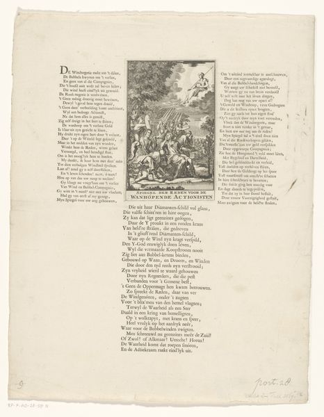
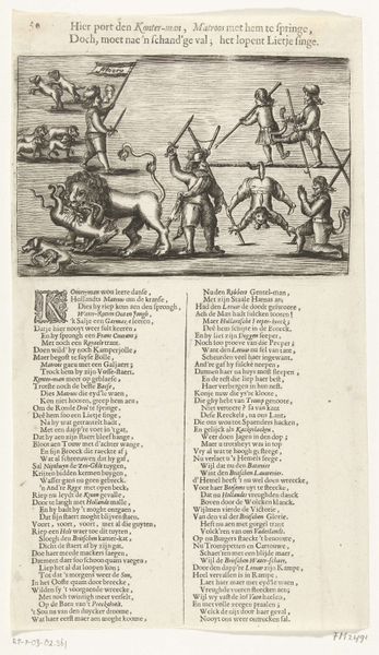
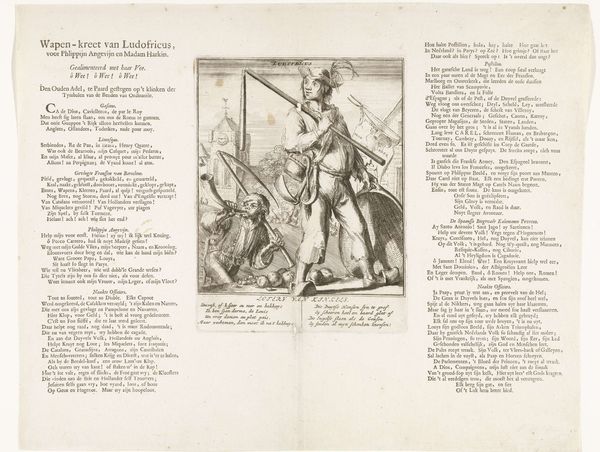
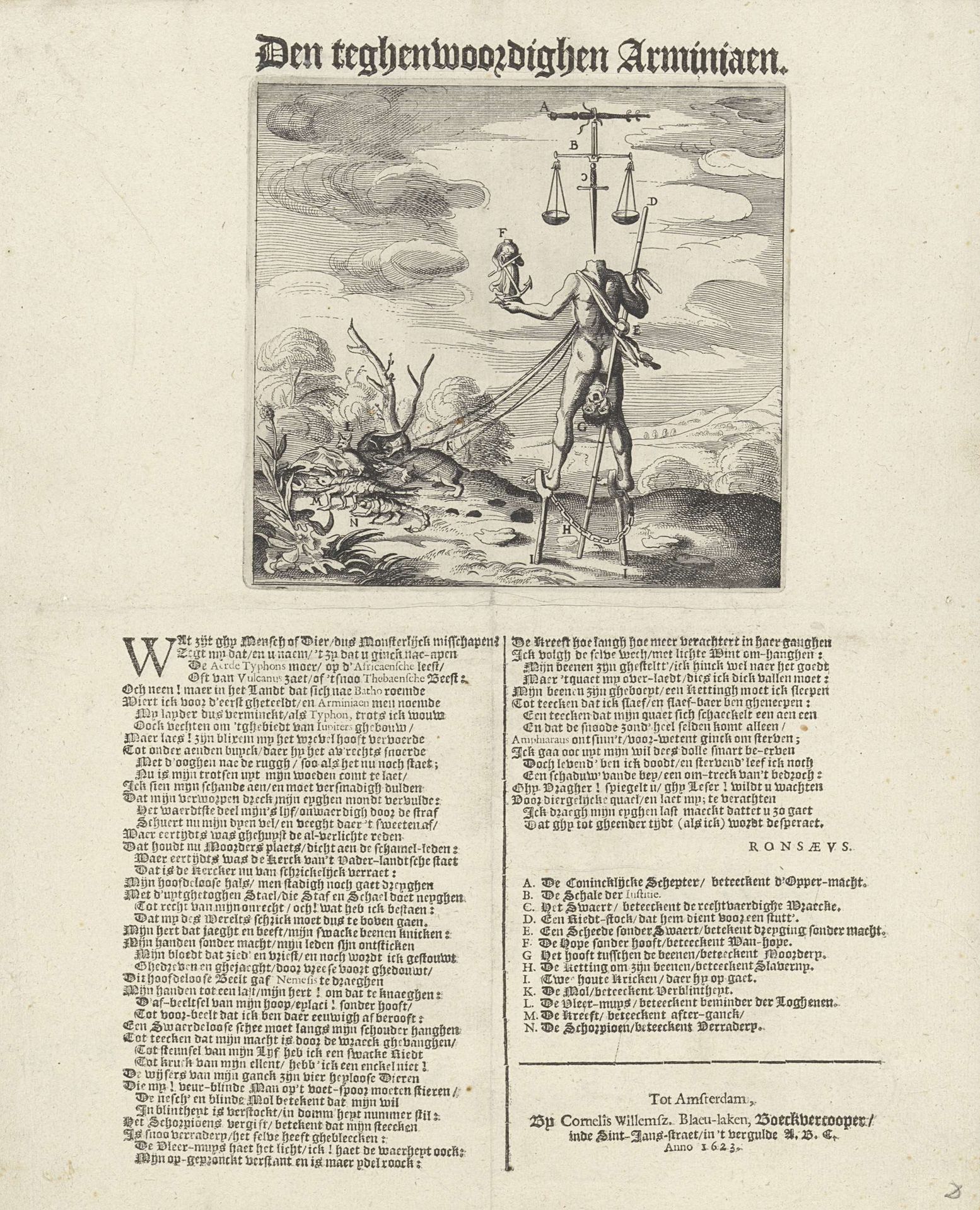
Editor: So, this engraving is called "Spotprent op de arminianen" by Claes Jansz. Visscher, created in 1623. It's quite intricate; a very detailed print. There's a strange figure at the center, with a balance and other odd symbols. It feels almost nightmarish. What do you see in this piece? Curator: Well, formally, the composition strikes me first. We have this figure elevated, almost floating in a liminal space. The contrast of light and shadow, so typical of Baroque prints, enhances the dramatic tension. Note how Visscher uses the lines to define not just form, but also texture, creating a dynamic interplay. Does this complexity add to the initial mood you identified? Editor: Definitely. All the lines make it busy, chaotic even. So, you’re looking at it mostly through the elements of art itself, not necessarily what it means? Curator: Precisely. The symbolic meaning might shift with interpretation over time. The skill lies in how the artist manipulates line, form, and composition to convey feeling. The balance at the top… the figure, literally unbalanced, on stilts... everything is deliberately placed to create dissonance. What’s your reaction to how the print uses symbolic personification? Editor: It feels satirical. Like they're making fun of something by exaggerating features. I hadn't noticed all the formal choices, but they contribute a lot to the emotional impact. It feels less like just a historical document and more like, well, *art.* Curator: And in recognising how line and form combine you’ve reached your own, formal, and deeply informed assessment of the piece.
Artwork details
- Medium
- graphic-art, print, engraving
- Dimensions
- height 346 mm, width 283 mm
- Location
- Rijksmuseum
- Copyright
- Rijks Museum: Open Domain
Tags
Comments
Share your thoughts
About this artwork
Editor: So, this engraving is called "Spotprent op de arminianen" by Claes Jansz. Visscher, created in 1623. It's quite intricate; a very detailed print. There's a strange figure at the center, with a balance and other odd symbols. It feels almost nightmarish. What do you see in this piece? Curator: Well, formally, the composition strikes me first. We have this figure elevated, almost floating in a liminal space. The contrast of light and shadow, so typical of Baroque prints, enhances the dramatic tension. Note how Visscher uses the lines to define not just form, but also texture, creating a dynamic interplay. Does this complexity add to the initial mood you identified? Editor: Definitely. All the lines make it busy, chaotic even. So, you’re looking at it mostly through the elements of art itself, not necessarily what it means? Curator: Precisely. The symbolic meaning might shift with interpretation over time. The skill lies in how the artist manipulates line, form, and composition to convey feeling. The balance at the top… the figure, literally unbalanced, on stilts... everything is deliberately placed to create dissonance. What’s your reaction to how the print uses symbolic personification? Editor: It feels satirical. Like they're making fun of something by exaggerating features. I hadn't noticed all the formal choices, but they contribute a lot to the emotional impact. It feels less like just a historical document and more like, well, *art.* Curator: And in recognising how line and form combine you’ve reached your own, formal, and deeply informed assessment of the piece.
Comments
Share your thoughts