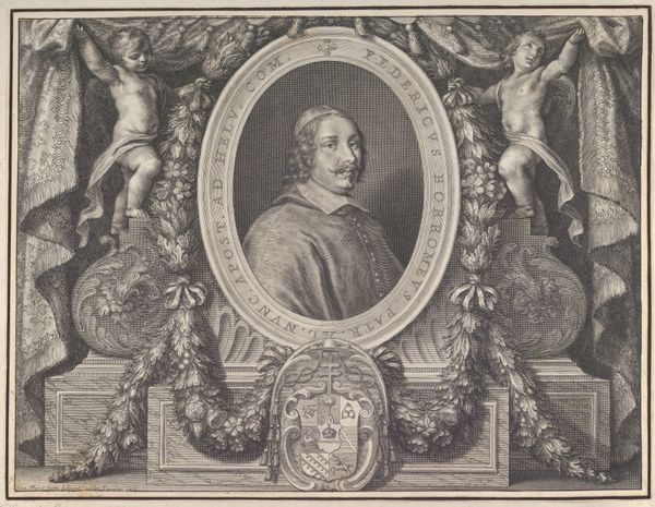
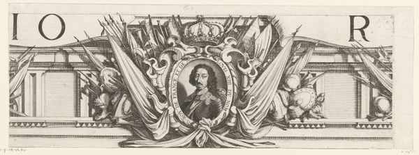
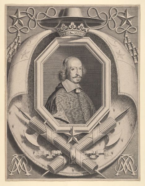
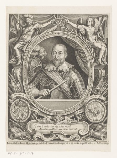
Promotieprent van Raymundus Berengarius van Lotharingen (1660), bovenste gedeelte 1660 - 1668
0:00
0:00
pietervanschuppen
Rijksmuseum
drawing, print, etching, pen, engraving
#
portrait
#
drawing
#
baroque
#
pen drawing
# print
#
etching
#
old engraving style
#
pen-ink sketch
#
surrealism
#
pen
#
history-painting
#
engraving
Dimensions: height 425 mm, width 568 mm
Copyright: Rijks Museum: Open Domain
Editor: So, this is a promotional print of Raymundus Berengarius van Lotharingen, created around 1660 by Pieter van Schuppen. It's an engraving, and honestly, it feels both intensely ornate and a little...imposing. What do you make of it? Curator: Imposing, yes! It’s classic Baroque; a visual feast intended to overwhelm. All those symbols swirling around his portrait are practically screaming his importance. Look closely—notice how the drapery almost spills out of the frame? It's drama for drama's sake. Do you think all those emblems truly communicate something, or simply add to the sense of power? Editor: It feels more like the latter, honestly. There's *so* much crammed in, it's hard to focus on any single detail. Do you think this busyness was intentional, maybe to impress rather than inform? Curator: Absolutely. Think about the intended audience. This wouldn't have been for the masses. It was meant for nobles, other leaders, people who understood that art equaled authority. It's saying, "Look how many honours and virtues this man possesses!" It’s the 17th-century equivalent of an influencer’s meticulously curated Instagram feed, isn't it? Only, carved in ink, a statement as durable as stone. Does the contrast between Raymundus’ calm demeanour and the swirling symbols change how you perceive the subject? Editor: Yes, actually, that contrast makes him appear more human, more approachable despite the obvious propaganda around him. Curator: Precisely! Van Schuppen gives him a certain gravitas, but that humanity also sneaks through. And sometimes, art reveals the most by what it *doesn't* explicitly say. What do you think? Editor: I think it's fascinating how art can be both a statement and a performance, projecting an image while simultaneously hinting at the person underneath. This piece has definitely given me a new perspective on promotional portraiture.
Comments
No comments
Be the first to comment and join the conversation on the ultimate creative platform.
More like this