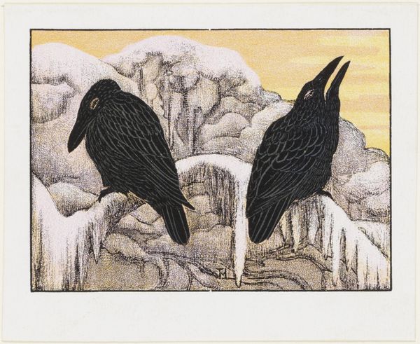
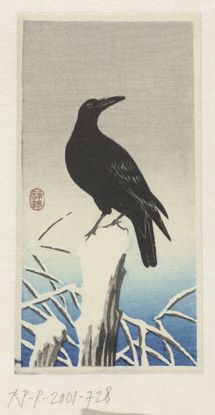
graphic-art, print, etching, woodcut
graphic-art
art-nouveau
etching
landscape
woodcut
symbolism
watercolour illustration
watercolor
Dimensions: height 89 mm, width 125 mm
Copyright: Rijks Museum: Open Domain
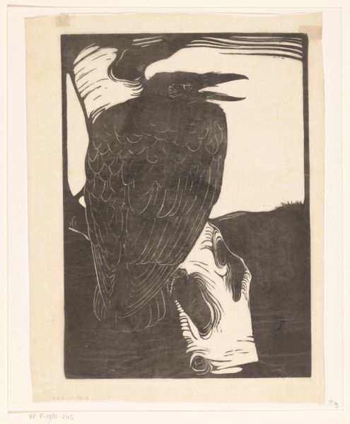
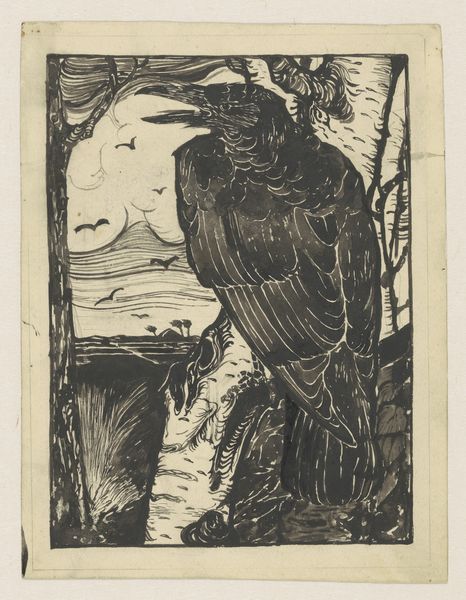
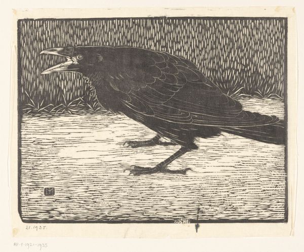
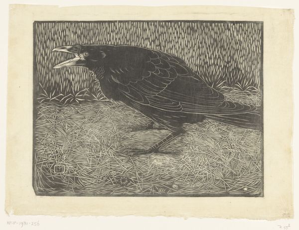
Curator: This is Theo van Hoytema’s “Omslag zakkalender voor Van Houten Cacao” from 1903. What's your initial response to this print? Editor: Stark. The muted palette and the somber birds evoke a distinct feeling of melancholy. There’s a graphic quality, almost like a woodblock print. Curator: Indeed, Hoytema employed graphic arts, etching, and woodcut techniques to achieve this particular aesthetic. Given its purpose as a calendar cover for Van Houten Cacao, let's think about mass production and distribution. How does this impact your reading of it? Editor: Knowing that it was meant for mass consumption actually enriches the work for me. I find a deliberate artistic intention in the way composition emphasizes the materiality of ink and paper, which in return encourages tactile engagement and a closer inspection. Curator: Interesting point. As a commercial piece, consider the intended audience and the social context of the time. What ideas about labor, craft, and consumerism do you think the image suggests? Editor: I see an interesting juxtaposition. The choice of this rather severe, stark imagery clashes with the idea of the warm comfort one associates with cacao. Perhaps it aimed for a more sophisticated, less sentimental market? The Symbolist influence also infuses it with complex, maybe even darker connotations beyond simple product appeal. Curator: Symbolism definitely plays a significant role. The crows, the stark landscape...there's a deeper narrative hinted at, moving beyond a mere advertisement. Considering semiotics, how would you interpret these symbols? Editor: The crows, traditionally harbingers of doom, are rendered with a weary, almost resigned air. The minimalist color palette further enhances the bleakness. It invites introspection, almost suggesting the cyclical nature of time or the end of year which aligns with calendar imagery. The material grain reinforces these sensations with the weight and feel of ink and paper. Curator: And structurally, notice how the composition directs the viewer’s eye, using the contrast between the dark birds and the lighter background to create a balanced yet unsettling image. Editor: It’s remarkable how Hoytema combined these elements – a sense of stark beauty and brooding atmosphere, considering it was ultimately a promotional item. A nice confluence of form meeting its function. Curator: Ultimately, what does this piece reveal about the intersections of commerce and art? Editor: It proves that the artistic intention can coexist with commercial demands, challenging traditional distinctions between design and fine art through striking aesthetic execution. It allows for deeper engagement beyond fleeting advertisement appeal.
Comments
No comments
Be the first to comment and join the conversation on the ultimate creative platform.