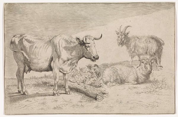
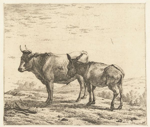
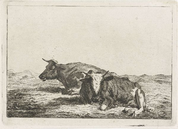
drawing, print, etching
#
drawing
#
neoclacissism
# print
#
etching
#
landscape
#
genre-painting
#
realism
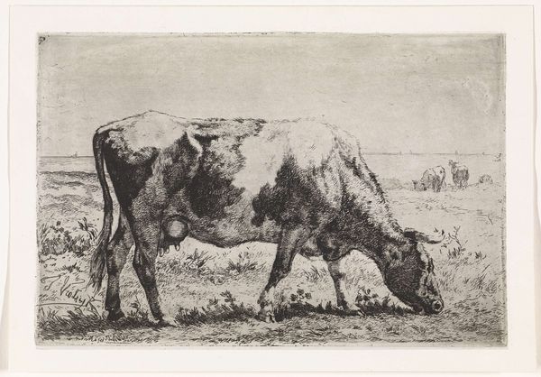
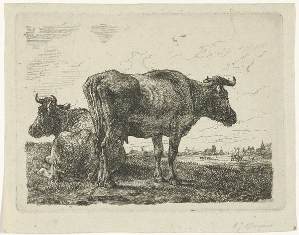
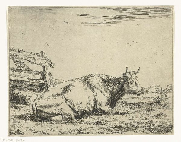
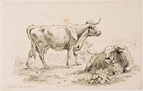
Dimensions: height 152 mm, width 189 mm
Copyright: Rijks Museum: Open Domain
Curator: Here we have Wouter Johannes van Troostwijk’s “Liggende en staande koe in een weiland,” or “Lying and Standing Cow in a Meadow,” created around 1810. It's currently held here at the Rijksmuseum. Editor: There’s a pastoral serenity to it. The composition is quite stark, dominated by the presence of these two cows. It’s an etching, and the limited tonal range reinforces a kind of subdued tranquility, don’t you think? Curator: Indeed. Beyond the visual appeal, what strikes me is the rising bourgeois class in the Netherlands during the early 19th century. This print reflects a growing interest in rural life. Art became a means of celebrating Dutch identity and landscape, aligning with both Neoclassical ideals and a budding Realism. Editor: The positioning is intriguing; the standing cow acting as a vertical counterpoint to the horizontal of the reclining one. It creates a subtle dynamism within the quiet scene. And those meticulous etched lines... such detail to delineate the form and texture. Curator: Certainly. Prints like these circulated widely, contributing to a shared visual culture. Note how it portrays farm animals not as symbols of labor, but as emblems of an idealized existence, a sentiment popularized by Romantic notions of nature. Editor: Though labeled Realism, there’s clearly a degree of stylization at play. The landscape elements seem almost perfunctory—meant only as a backdrop. The cows themselves are foregrounded, the primary subjects of aesthetic scrutiny, defined through sharp contrast and texture. Curator: Right. Its accessible format democratized art, allowing ordinary people to engage with idealized depictions of rural life, influencing perceptions about the national character and its connection to the land. This shaped a sense of Dutch identity beyond the urban centers of power. Editor: Well, for me, it boils down to how the artist used line to articulate form and create depth. It's a deceptively simple scene but executed with remarkable skill in the printmaking process. Curator: I appreciate the artistry, but it's the intersection of that artistry with emerging social values that holds my fascination. Editor: A compelling convergence indeed, blending the representational with the historical.
Comments
No comments
Be the first to comment and join the conversation on the ultimate creative platform.
More like this