drawing, graphic-art, print, paper, typography
drawing
graphic-art
aged paper
script typography
hand drawn type
hand lettering
paper
personal sketchbook
typography
hand-drawn typeface
fading type
stylized text
thick font
handwritten font
Dimensions height 237 mm, width 315 mm
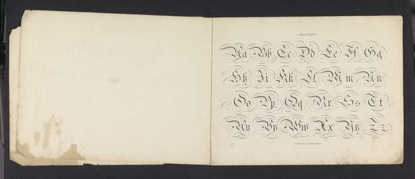
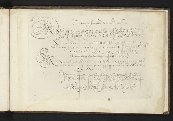
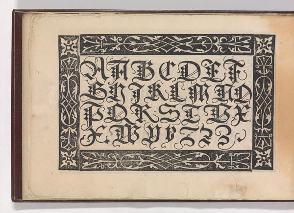
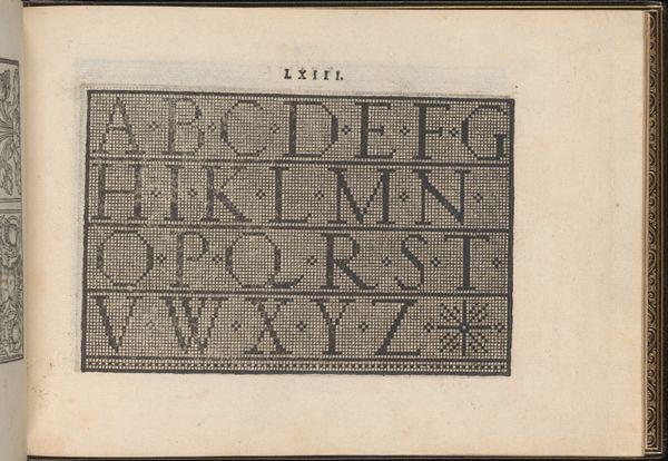
Curator: This graphic work is titled "Alfabet in Romein," created by Pieter Wilhelmus van de Weijer in 1855. It's a lithograph, a study of typography preserved on paper, and part of the Rijksmuseum's collection. What's your initial read? Editor: Immediately, it feels like stumbling upon a forgotten scholar's notebook. A whisper from the past, the kind of alphabet you’d expect to find etched into a treasure map, with all its hopeful promises. Curator: Note the construction of each letter. Van de Weijer explores the Roman alphabet by embellishing serifs and thick, consistent strokes, demonstrating technical proficiency, while capturing historical elements. It's very characteristic of the Neoclassical movement of that time. Editor: Yes, that Neoclassical rigidity is evident. But look closer - there are minor flaws within the execution, slight asymmetries, perhaps imperfections in the printmaking process. These give this strict formal arrangement an endearingly human, relatable vulnerability. Curator: The medium also supports this—lithography allowed artists to reproduce detailed line work. By looking at line weights and letter spacing we can identify a clear systematic planning of each glyph, but also see that it was printed, multiplying the touch. Editor: Imagine Van de Weijer meticulously crafting each letterform. Each has personality despite being replicated over and over in printmaking! Also, I sense a quiet dedication in meticulously recording these Roman types; each symbol becomes a vessel carrying echoes of empires long since gone. Curator: This is a prime example of accessible educational tools disseminated through printmaking at that period, a way of standardization and appreciation of Roman alphabets within the developing field of typography. It reveals much about 19th century pedagogical practices. Editor: For me it is something about aging: its aesthetic power, the beauty in knowing this Roman alphabet remains vital despite the shifting sands of time and styles. What do you feel upon closer inspection? Curator: It's fascinating how it shows a bygone dedication to the ideals of order and clarity. Editor: And, somehow, beauty shines through.
Comments
No comments
Be the first to comment and join the conversation on the ultimate creative platform.
More like this