drawing, print, paper, engraving
#
portrait
#
drawing
#
baroque
#
dutch-golden-age
# print
#
paper
#
line
#
engraving
Dimensions: 456 × 305 mm (image/plate); mm 513 × 366 (sheet)
Copyright: Public Domain
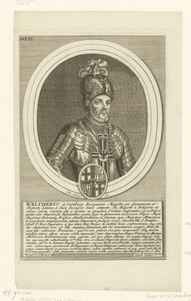
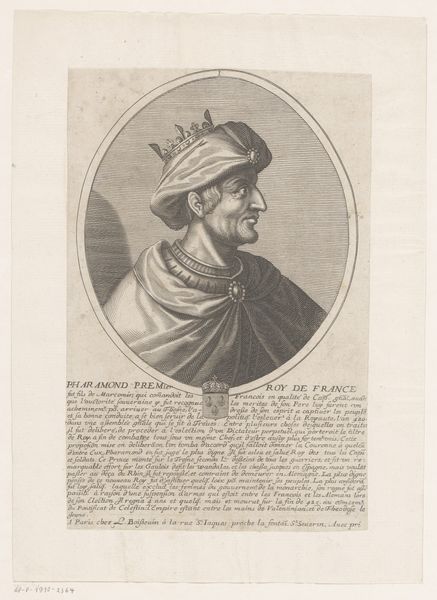
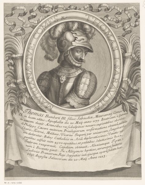
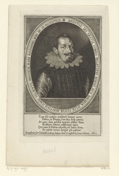
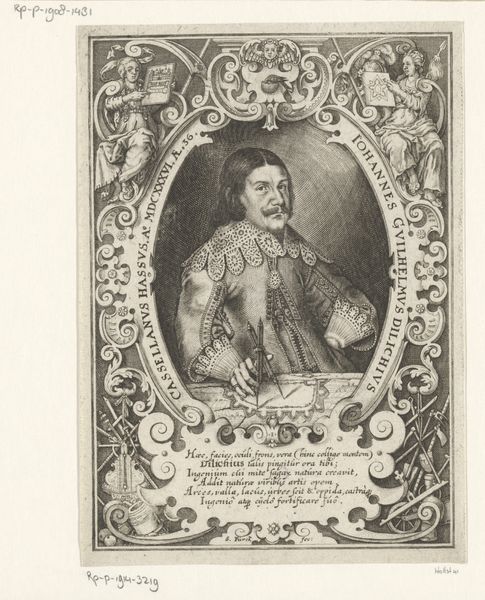
Curator: Standing before us is a rather striking engraving entitled "Jan van der Does, from Quatuor Personae," crafted in 1649 by Cornelis Visscher. Editor: Intensely formidable is my initial impression. The subject's gaze projects confidence, almost defiance. The high contrast accentuates the minute textural details throughout. Curator: Precisely. Visscher masterfully employs line engraving to create depth and detail, typical of Dutch Golden Age portraiture. Note the meticulous rendering of textures: the sheen of the armor, the patterned fabric, even the individual hairs of the sitter's mustache. Semiotically, what do these details signify? Editor: Power and status are immediately apparent. Jan van der Does was clearly a man of significance, a leader of men in 17th-century Netherlands. The landscape in the background provides a setting in context. Look how strategically this places him within the sphere of influence of that era. Curator: Absolutely. Visscher’s deployment of Baroque drama is subtle yet ever present. The light source, seemingly from the left, throws his facial features into contrast to bring forward the image, a classic play with chiaroscuro. The engraving embodies this ethos within the constraints of its medium. Editor: The inclusion of inscriptions beneath the portrait provides context. These elements reinforce the artwork’s historical purpose. Who exactly was its intended audience and what role did engravings like this one play in shaping public perception and immortalization of leading members of society? Curator: Intriguing to observe the symbolic weight that portraiture, and printmaking more specifically, once held. Every deliberate mark adds an undeniable weight to the work. Editor: Looking closer, considering the print as a historical document that helps visualize that period adds another enriching dimension of understanding beyond its composition. Curator: I agree. I find this interplay of textures, lines, and considered light incredibly appealing to my formal sensitivities, even after considering its cultural history. Editor: This portrait leaves us contemplating how images have been strategically deployed throughout the course of history to influence the narrative. A very compelling work that blends historical context with formal refinement.
Comments
No comments
Be the first to comment and join the conversation on the ultimate creative platform.
More like this