About this artwork
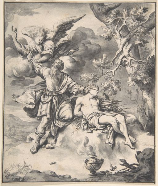
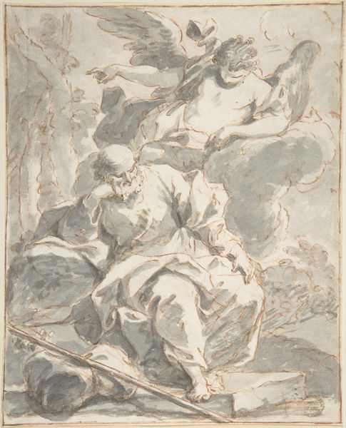
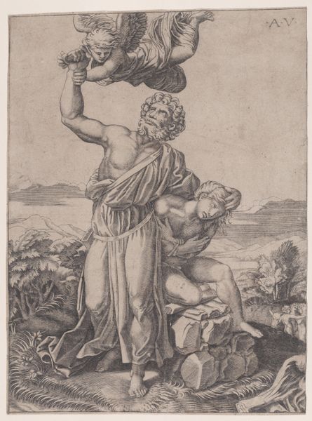
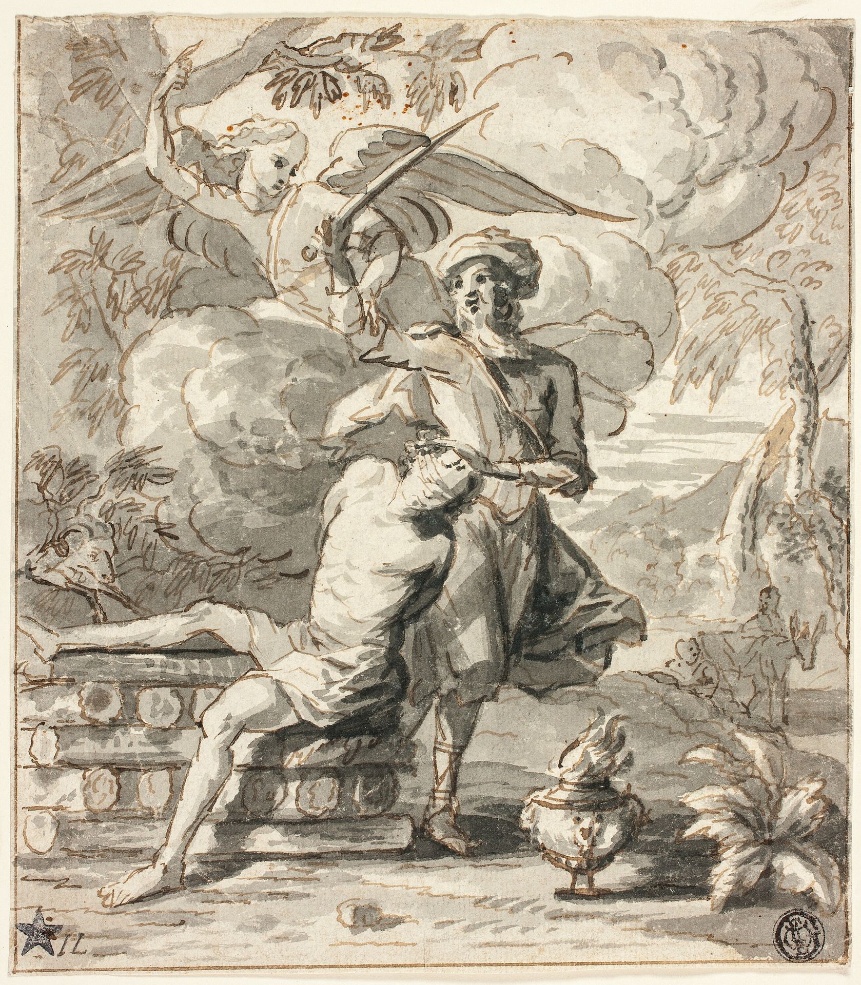
Editor: Here we have Jan Lievens’ “Sacrifice of Abraham,” a drawing of undetermined date rendered in ink, chalk and coloured pencil. The composition, with its dramatic figures and swirling clouds, evokes a sense of Baroque dynamism. What do you make of the work’s aesthetic choices? Curator: Indeed, Lievens masterfully orchestrates the visual elements to convey the scene's emotional intensity. Consider the diagonal thrust of Abraham’s arm, poised with the blade, against the recessive posture of Isaac on the altar. How does this calculated asymmetry inform your reading? Editor: It certainly builds the tension. But it’s the interruption by the angel—the swirling fabrics and forceful gesture—that resolves it. Curator: Precisely. The angel’s intervention introduces a countervailing force. Note how the artist employs chiaroscuro to highlight the angel and Isaac, drawing our gaze to the critical figures and away from Abraham. Do you find the value contrasts heighten the drama? Editor: Yes, definitely. The stark difference in values focuses my eye where the action is and adds impact to the angel’s appearance. I'm beginning to appreciate how meticulously Lievens crafted the visual experience. Curator: Reflect also on how Lievens organizes line and tone. Note how specific lines give us contour while tone creates the illusion of depth, producing areas that are highlighted against the background to increase the contrast. By focusing on such aspects, the emotive power is all the more impressive, wouldn't you agree? Editor: Absolutely. Seeing how each formal element contributes to the whole provides a new depth to the artwork. Thank you.
Sacrifice of Abraham n.d.
Artwork details
- Medium
- drawing, coloured-pencil, print, paper, ink, chalk
- Dimensions
- 185 × 164 mm
- Location
- The Art Institute of Chicago
- Copyright
- Public Domain
Tags
drawing
coloured-pencil
narrative-art
baroque
figuration
paper
ink
coloured pencil
chalk
history-painting
Comments
No comments
About this artwork
Editor: Here we have Jan Lievens’ “Sacrifice of Abraham,” a drawing of undetermined date rendered in ink, chalk and coloured pencil. The composition, with its dramatic figures and swirling clouds, evokes a sense of Baroque dynamism. What do you make of the work’s aesthetic choices? Curator: Indeed, Lievens masterfully orchestrates the visual elements to convey the scene's emotional intensity. Consider the diagonal thrust of Abraham’s arm, poised with the blade, against the recessive posture of Isaac on the altar. How does this calculated asymmetry inform your reading? Editor: It certainly builds the tension. But it’s the interruption by the angel—the swirling fabrics and forceful gesture—that resolves it. Curator: Precisely. The angel’s intervention introduces a countervailing force. Note how the artist employs chiaroscuro to highlight the angel and Isaac, drawing our gaze to the critical figures and away from Abraham. Do you find the value contrasts heighten the drama? Editor: Yes, definitely. The stark difference in values focuses my eye where the action is and adds impact to the angel’s appearance. I'm beginning to appreciate how meticulously Lievens crafted the visual experience. Curator: Reflect also on how Lievens organizes line and tone. Note how specific lines give us contour while tone creates the illusion of depth, producing areas that are highlighted against the background to increase the contrast. By focusing on such aspects, the emotive power is all the more impressive, wouldn't you agree? Editor: Absolutely. Seeing how each formal element contributes to the whole provides a new depth to the artwork. Thank you.
Comments
No comments