coloured-pencil, tempera, print, engraving
#
coloured-pencil
#
medieval
#
narrative-art
#
tempera
# print
#
figuration
#
coloured pencil
#
history-painting
#
engraving
#
watercolor
Copyright: National Gallery of Art: CC0 1.0
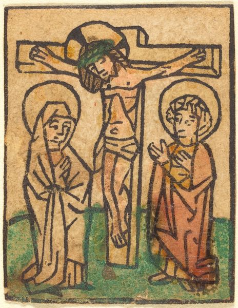
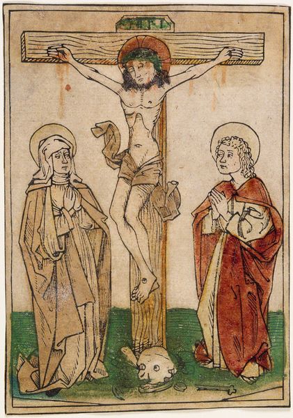
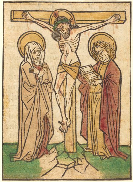
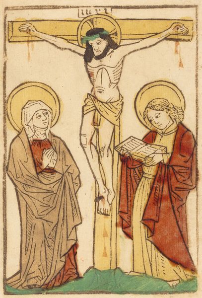
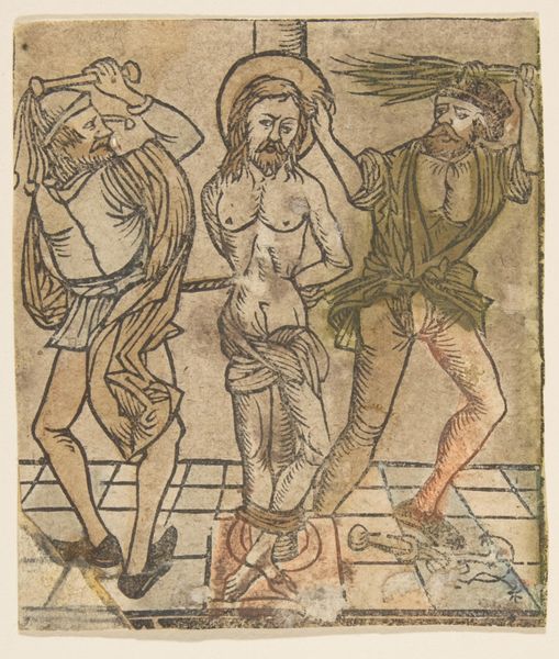
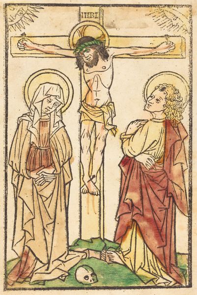
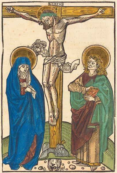
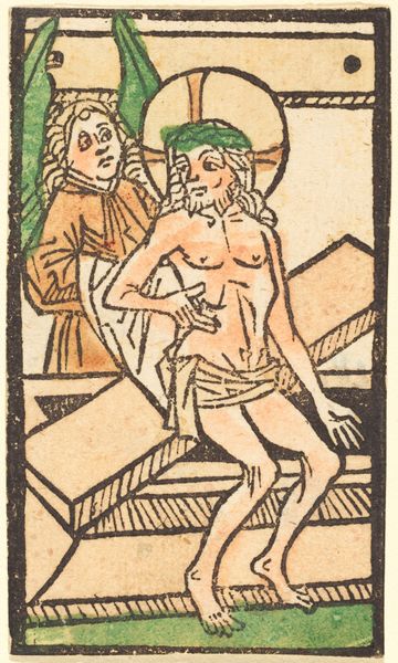
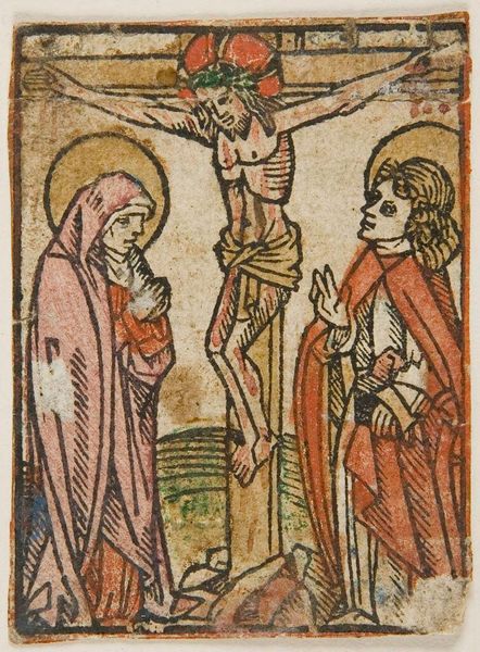
Curator: Looking at this piece, "Christ on the Cross between the Two Thieves," created around 1475 by an anonymous artist, what catches your eye? Editor: Honestly, it feels like a raw nerve laid bare. The composition, though seemingly simple, carries this intense emotional weight. The artist used a limited palette, but it feels more potent, you know? Curator: Indeed. The artist uses tempera, colored pencil and engraving techniques to structure a rather complex theological scene. The application of color, specifically the strong blues and reds against the pale figures, creates stark contrasts. Semiotically, this could represent a clear divide between spiritual mourning and the profane reality of execution. Editor: Exactly. It's like those bold colors heighten the drama. But even more striking, isn’t it the raw vulnerability in Christ’s sagging form? I feel a painful kind of dissonance here – divinity facing mortality. It almost aches. Curator: Consider how the bodies, each rendered with distinct anatomical awareness or lack thereof, operate as visual indicators. Christ’s central figure presents an attempt at realism, contrasted with the almost caricatured thieves flanking him. This may signify an effort to isolate and elevate His suffering from the common criminality surrounding him. Editor: And those supporting figures at the base—the Virgin Mary, I assume?-- are these sort of architectural pillars grounding the tragedy. They appear caught in an eternity of grief, almost blending into the earth while all this torment plays out above. I find a profound stillness there. Curator: Stylistically, the work embraces elements of medieval art, although the burgeoning use of perspective—however subtly executed—hint at Renaissance developments. The deliberate flattening of space focuses the viewer's attention solely on the theological message embedded within. Editor: You know, even if I strip away all the theological meaning, the artwork’s composition and the way it distorts or heightens each emotional reaction makes this very accessible, very visceral still. Its strength is not in complexity, but in this elemental portrayal of death. Curator: Agreed. Through its formal structures, we unravel a powerful narrative that continues to speak across centuries. It is really about structure and composition. Editor: And maybe a splash of raw, heart-wrenching honesty. I’m glad it got me thinking this morning.
Comments
No comments
Be the first to comment and join the conversation on the ultimate creative platform.
More like this