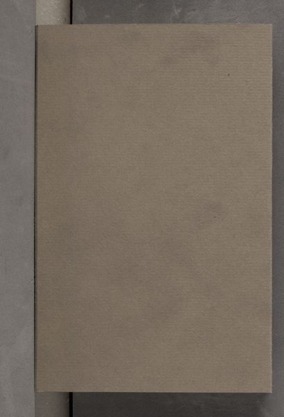
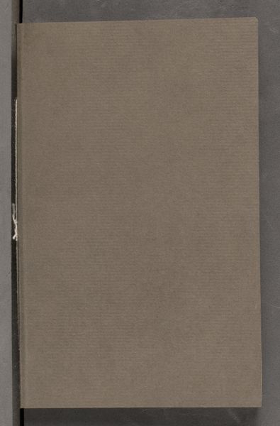
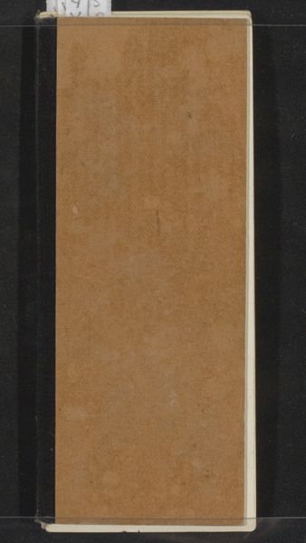
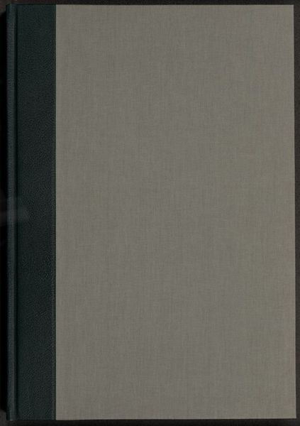
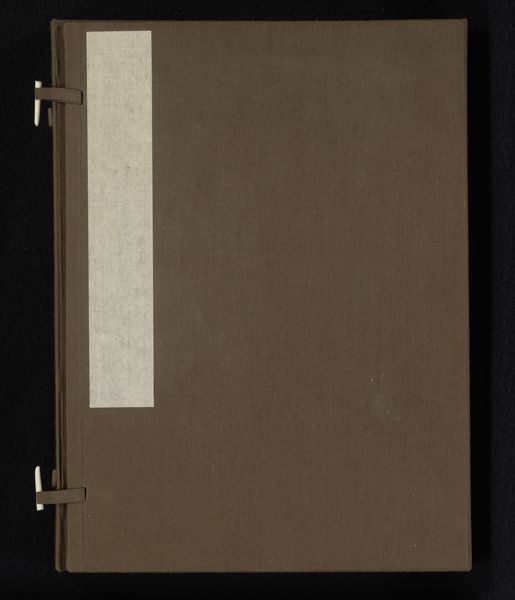
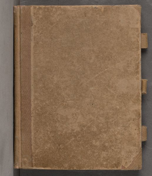
mixed-media, textile
#
mixed-media
#
textile
#
hard-edge-painting
Dimensions: height 280 mm, width 228 mm, thickness 42 mm
Copyright: Rijks Museum: Open Domain
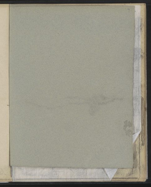
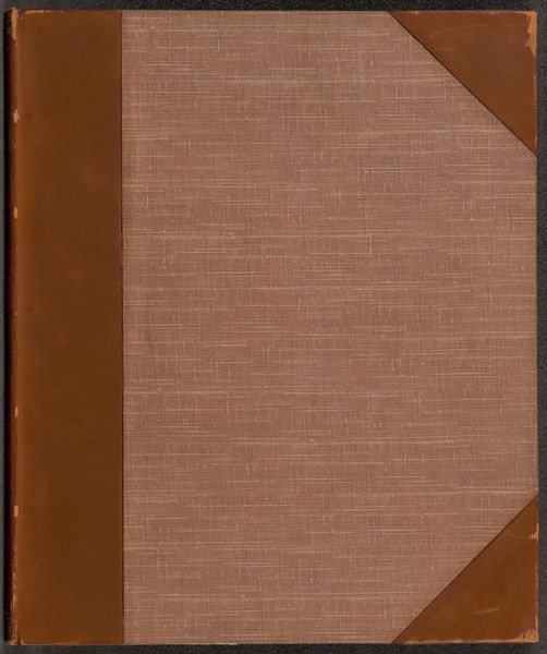
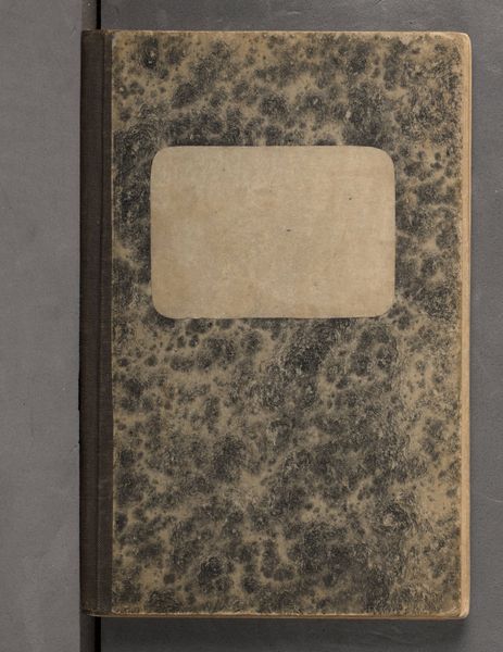
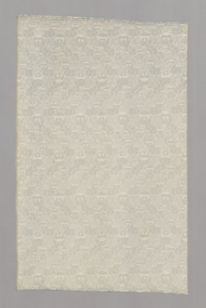
Curator: This is “Zuid-Afrika 1961-1963” by Karel Frederik van den Berg, created before 1963, employing mixed media including textile elements. Editor: Huh, looks like a well-worn journal cover. Very tactile, makes me want to run my fingers across it. It evokes a feeling of secrecy, of untold stories held within. Curator: Indeed. The textile component immediately disrupts the assumed flatness of a painting. It introduces a textural depth, almost a haptic dimension that challenges our perception of surface and plane. The artist experiments with Hard-Edge painting that further abstracts any narrative. Editor: You know, it almost feels...protective? Like armor, maybe? Given the title referencing South Africa during that period, it makes you wonder about the secrets and hard truths it might be shielding. What does it mean to shroud that place and time with layers of linen? Curator: The austere quality of the mixed media, combined with this restrained palette, demands an assessment of compositional relationships, particularly the subtle interplay between the tactile surface and structural elements. Editor: I’m just struck by its silence. The plainness is so potent—it feels like the absence of something clamoring to be heard. Does that absence amplify what’s *not* being explicitly represented about South Africa? Is the point to confront or conceal, or some tense negotiation between the two? Curator: One could posit that such material articulations expose the complex layers that underlie even the seemingly simple, highlighting fundamental contrasts present both visually and thematically within its broader artistic schema. Editor: I love it. It’s a masterclass in visual understatement; like a Zen koan. Curator: A valid assessment that provides considerable depth regarding the interplay between surface and structural intent, ultimately underscoring the complex and sophisticated language inherent within this artistic artifact. Editor: For me, it’s a quiet, powerful whisper, more profound than any shout. Thanks, Karel.
Comments
No comments
Be the first to comment and join the conversation on the ultimate creative platform.
More like this