drawing, pen
#
portrait
#
drawing
#
imaginative character sketch
#
toned paper
#
light pencil work
#
quirky sketch
#
baroque
#
figuration
#
personal sketchbook
#
sketchwork
#
line
#
sketchbook drawing
#
pen
#
watercolour illustration
#
storyboard and sketchbook work
#
sketchbook art
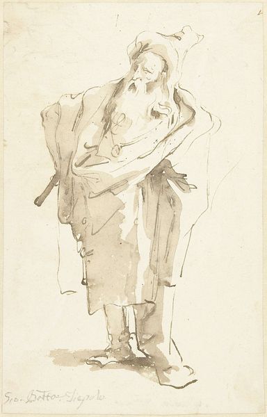
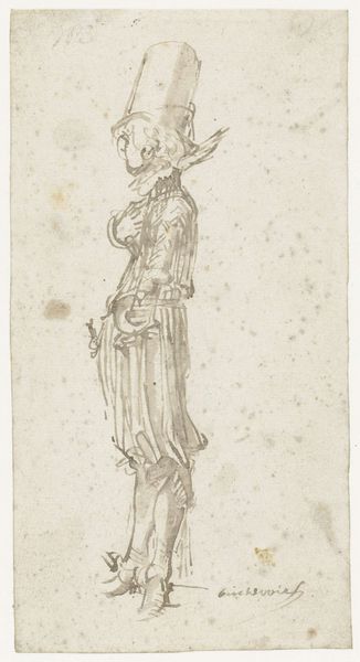
Dimensions: height 160 mm, width 97 mm
Copyright: Rijks Museum: Open Domain
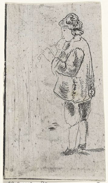
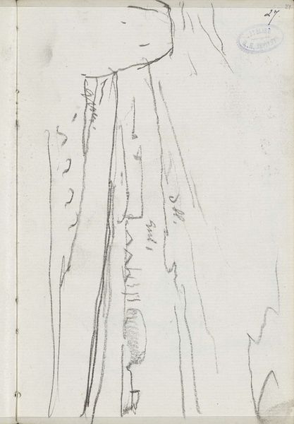
Curator: Harmen ter Borch’s “Man in een cape,” dating back to approximately 1649, invites us to ponder character and form through the delicate medium of pen on toned paper. You find it how? Editor: Haunting! It's a study in lines, really—sparse and somewhat severe. The cape looks heavy, and he seems almost swallowed by it. Is he burdened, I wonder? Curator: Burdened, or perhaps simply self-contained? Look closely at the hatching technique Ter Borch employs; those parallel lines defining the cape not only create volume but also a sense of controlled drapery. It's Baroque restraint at its finest. Editor: Absolutely, and the restricted palette intensifies that austerity. There’s barely any light to play with; just tonal gradations creating a sombre atmosphere, but a light that almost carves him out of nothing. Curator: He exists from the sheer artistic touch of the pen...It makes you appreciate how the simplest means can suggest complex personalities. Think about it—this might just be a quick sketchbook doodle, yet it resonates with the gravitas we often associate with Ter Borch’s meticulously finished paintings. Editor: I see it! The formal elements absolutely echo his more elaborate pieces. That cape isn't just cloth; it's architecture! Still, the quick nature of this, that this wasn't considered that serious makes the sketch feel incredibly honest, like we’re seeing ter Borch think, but on paper. Curator: That honesty… it gets me thinking that art doesn't always have to shout. This drawing whispers volumes about form, about character, and about the soul of artmaking. Editor: It leaves so much open for the mind to work with! So good...Yes, in those quiet strokes, Ter Borch shows how simplicity, rather wonderfully, amplifies a piece, lets it resound louder and more clearly.
Comments
No comments
Be the first to comment and join the conversation on the ultimate creative platform.
More like this