print, paper
portrait
script typeface
aged paper
homemade paper
script typography
paperlike
paper
hand-drawn typeface
thick font
history-painting
handwritten font
letter paper
historical font
Dimensions: height 95 mm, width 255 mm, thickness 5 mm
Copyright: Rijks Museum: Open Domain
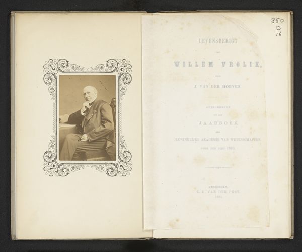
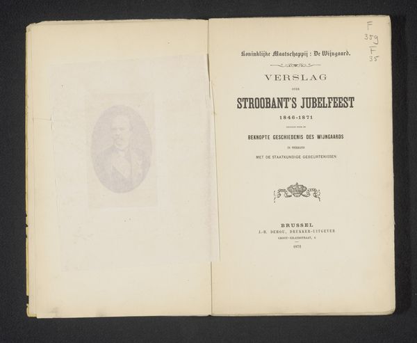
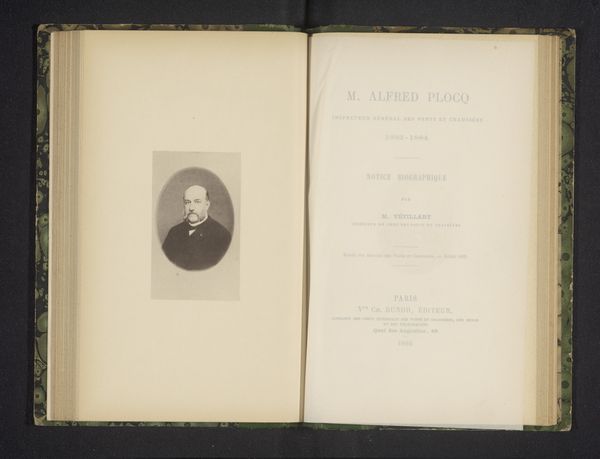
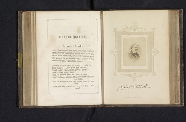
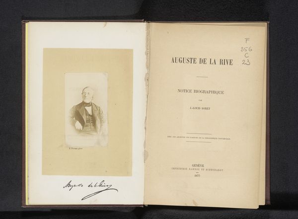
Curator: Here we have "Levensberigt van Willem Vrolik," printed in 1864. It appears to be a portrait and biographical text memorializing Willem Vrolik. What’s your first take? Editor: Well, immediately, I notice the paper itself—it's incredibly aged. You can practically feel the history just by looking at the textures and how they shaped the printing. There’s something satisfying about seeing the process revealed so starkly by time. Curator: It's striking how this aging also lends the portrait a sense of deep history. The paper’s fragility enhances the gravitas of the figure. There is a tradition here, you see? These memorials carried important social weight for the academic circles they came from. Editor: Absolutely. And, considering this was printed by C. G. van der Post in Amsterdam, the choice of materials reflects something about the culture of production at the time, doesn't it? I'd love to know about the quality, origin of that paper… was it commonplace or luxurious? Did it have social significance for this particular publisher or the academic world involved? Curator: These are excellent questions, essential for situating this piece! From a symbolic viewpoint, the typographic choices speak volumes too—that strong serif font for the title, offset against the handwritten font... These deliberate styles point to both authority and a personal, almost intimate remembrance. Editor: I see what you mean, the font does add a personalized flair despite it being a mass-produced print. I wonder if the printing was contracted, or printed on site at the academy. These are questions worth exploring. Curator: Indeed. The materiality and symbols work together to tell the story beyond just Vrolik's life; it whispers about the values of knowledge, memory, and the community that honors him. It also demonstrates continuity. Editor: Yes, the object really comes alive when you begin considering those interconnected layers: The hand of the maker, the history within the paper, and this layering together, which can open up fresh perspectives in cultural study.
Comments
No comments
Be the first to comment and join the conversation on the ultimate creative platform.
More like this