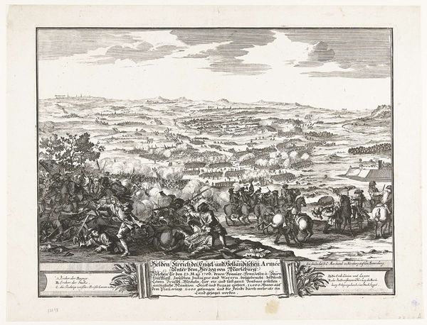
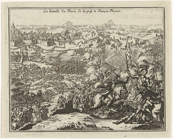
Filips IV de Schone verslaat de graaf van Vlaanderen bij Veurne, 1296 1620 - 1686
0:00
0:00
nicolascochin
Rijksmuseum
print, engraving
#
narrative-art
#
baroque
# print
#
figuration
#
line
#
cityscape
#
history-painting
#
engraving
Dimensions: height 167 mm, width 220 mm, height 238 mm, width 322 mm
Copyright: Rijks Museum: Open Domain
Editor: This is a print called "Filips IV de Schone verslaat de graaf van Vlaanderen bij Veurne, 1296," dating from 1620-1686, and is housed in the Rijksmuseum. The artist is Nicolas Cochin. It seems to depict a chaotic battle scene on the left, contrasting sharply with a formal receiving line on the right. How would you interpret this work? Curator: This engraving provides a clear dichotomy, doesn’t it? Note how Cochin contrasts the disarray of conflict with the rigidly structured scene of submission. Observe the formal construction, almost theatrical, in the right panel. The king is elevated, literally and figuratively. His figure dominates, centered beneath a canopy, whereas the battle scene recedes into the distance, a series of lines creating depth and mass. Do you perceive a narrative structure in its composition? Editor: Yes, now that you point it out, I see how the receding lines in the battle lead to the king. But it still feels unbalanced. Is that intentional? Curator: The imbalance, I would argue, reinforces the ideological purpose of the work. The chaos serves as a foil to the order established by royal authority. Line becomes crucial here; the crisp, controlled lines on the right showcase power, while the more frenetic lines on the left portray disorder, which leads into the ultimate control and domination of Filips IV. Editor: So, it is the sharp contrasts in line and composition that drive home the message? Curator: Precisely. Cochin utilizes these formal elements to underscore a message of absolute power and divine right. Notice, even, how light and shadow are deployed to further highlight this visual hierarchy, giving our eye clear direction. Editor: That’s a fascinating way to understand the print. I hadn't noticed how much the formal elements contributed to its message. Curator: It shows how form itself carries meaning, wouldn't you say? It adds depth to the print beyond a mere illustration of a historical event.
Comments
No comments
Be the first to comment and join the conversation on the ultimate creative platform.
More like this