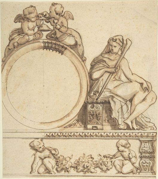
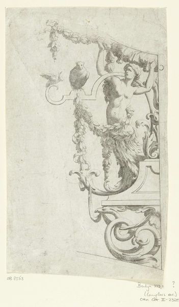
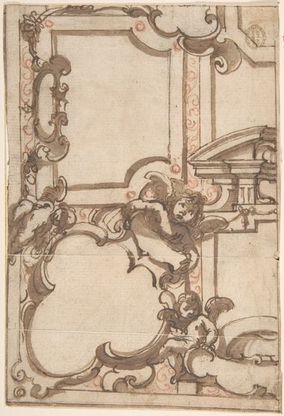
drawing, ink, pen
#
drawing
#
allegory
#
baroque
#
pen sketch
#
figuration
#
ink
#
pen
Copyright: Rijks Museum: Open Domain
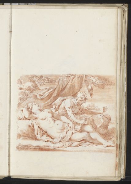
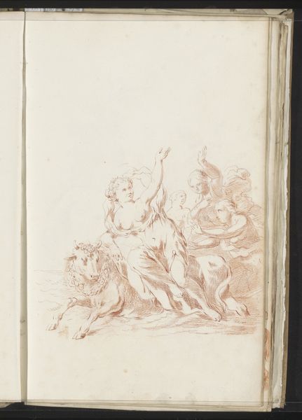
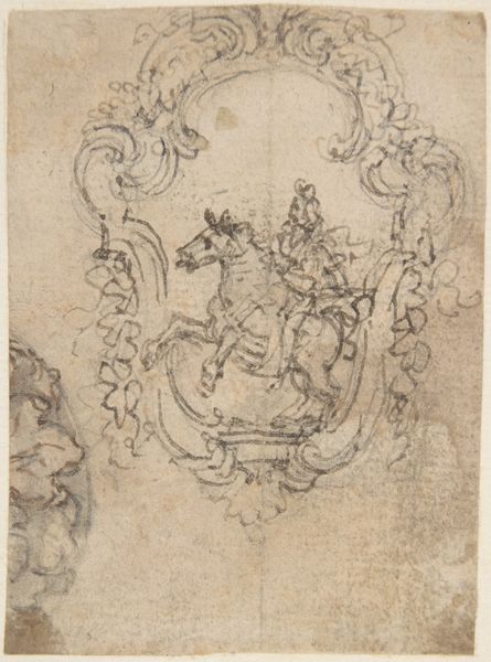
Editor: This is Jacob Toorenvliet’s "Cybele," a pen and ink drawing from around 1701. The delicate lines and the way the figures are placed give it an airy feel, even though the subject, with the lions, seems powerful. What do you make of its formal qualities? Curator: Note the emphasis on line. It delineates form without relying heavily on chiaroscuro to model volume. Observe the ornamental quality in the chariot's wheel, how that detail is mirrored by the detailing on her crown. Toorenvliet prioritizes linear grace over realism, doesn’t he? Editor: Yes, I see what you mean. The flatness makes the lions look a bit like decorations themselves, mirroring the chariot. Do you think the baroque style really pushes those formal elements in this drawing? Curator: Precisely. The dynamism of the Baroque, translated here through flowing lines and a calculated asymmetry in the placement of figures, serves the composition above all. Consider the semiotics; what do these signifiers, such as the lions or even the key held by Cybele represent within this composition? Editor: So it’s not just about *what* is depicted, but *how* the artist uses lines and forms to create a harmonious whole, where the meaning is derived as much from the technique as the subject? I guess I never really looked so closely at just line quality itself before. Curator: Exactly. Form and content are inseparable, with artistic treatment determining meaning and affect. And seeing such mastery of this Baroque drawing helps shed light on even contemporary works. Editor: I see! This drawing offered a different way to analyze the overall artwork. Thanks!
Comments
No comments
Be the first to comment and join the conversation on the ultimate creative platform.
More like this