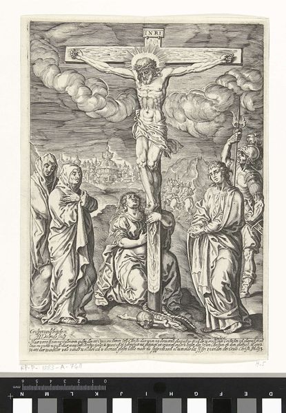
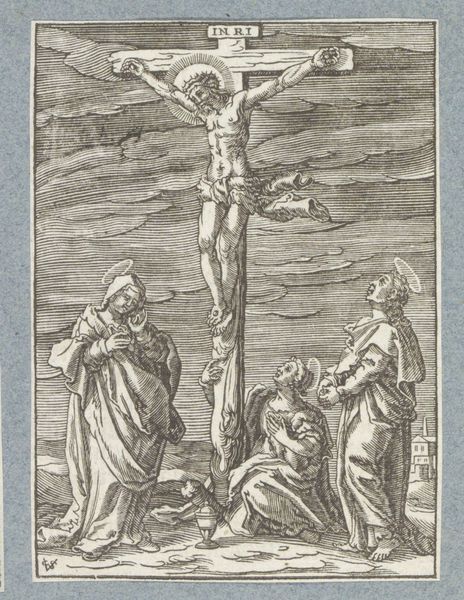
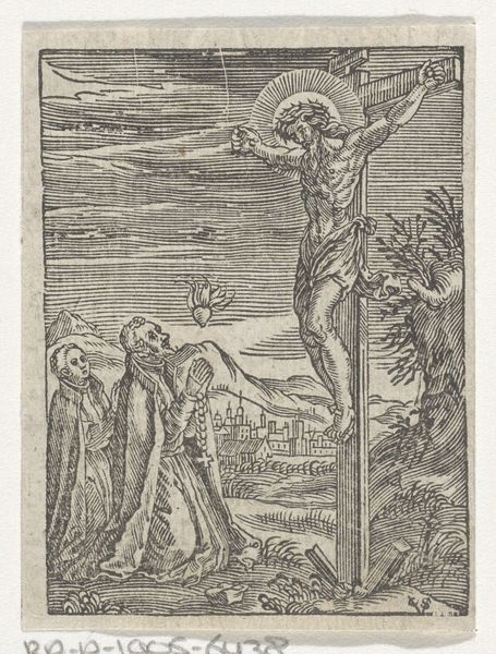
print, engraving
portrait
medieval
baroque
pen illustration
landscape
figuration
line
history-painting
engraving
Dimensions: height 111 mm, width 76 mm
Copyright: Rijks Museum: Open Domain
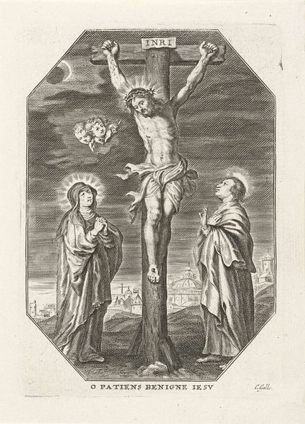
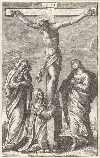
Editor: This print, "Christ on the Cross", comes to us from the period between 1595 and 1633 and is housed right here in the Rijksmuseum. Its creator remains anonymous. I am struck by how the use of line creates such an emotive response, a somber and reflective feeling. How do you read this piece? Curator: From a formal perspective, note the balanced composition, framed by the oval border. The artist uses stark contrasts of light and shadow to define form, and it contributes to the sense of drama. What do you notice about the use of line and how it directs the viewer's eye? Editor: Well, the lines are very precise and controlled. They create details on the figures, such as the folds in the robes or the musculature of Christ. And is the line work in the background less distinct than the foreground? Curator: Precisely. The delicate linework establishes a hierarchy, guiding our focus toward the central figure of Christ and then extending out towards Mary and an unamed second woman who mourns Christ, both standing in contrast to the background. Consider also how the composition directs our attention toward the inscription along the lower part of the oval: *O Christe humanae qui soluis crimina vitae. In me tristrantem lumina verte precor.* How does text as a design element impact this scene? Editor: So, the text underscores the devotional tone of the scene through both words and letter-forms. Thanks! I had not fully registered how this artistic choice shapes one's experience of the art. Curator: The interplay of line, light, and composition are a marvel in the service of religious feeling. It’s been rewarding to revisit it with you.
Comments
No comments
Be the first to comment and join the conversation on the ultimate creative platform.