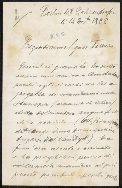
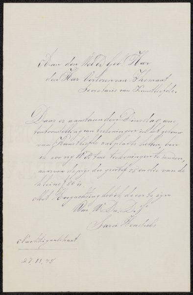
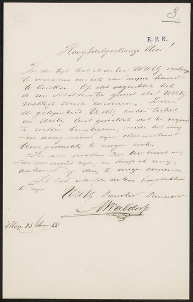
drawing, paper, ink, pen
#
portrait
#
drawing
#
paper
#
ink
#
intimism
#
romanticism
#
calligraphic
#
pen
#
calligraphy
Copyright: Rijks Museum: Open Domain
Editor: This piece, titled "Brief aan onbekend" – or "Letter to an Unknown" – is by G. Pingre, created sometime between 1800 and 1856. It's ink on paper, a handwritten letter. The delicate script gives it an air of intimacy and bygone eras. What strikes you most when you look at it? Curator: Immediately, the calligraphic quality of the writing commands attention. Observe how the ascenders and descenders of the letters create a dynamic rhythm across the page. The consistent pressure and elegant flourishes speak to a highly trained hand. Notice also the carefully considered placement of text blocks in relation to the paper's edges; it structures our reading of it. Does the layout or use of negative space offer insights, do you think? Editor: It does feel balanced, but not rigidly so. Almost conversational, mirroring the letter's function. What do you make of the ink itself? It’s a consistent tone; it almost looks sepia. Curator: Precisely. The monochrome ink, a deliberate artistic choice or a result of natural aging, unifies the visual field. This consistency emphasizes form and structure. The variation in line thickness adds depth despite the limited tonal range. This directs our vision; note how heavier strokes provide weight. The penmanship certainly feels as important as the words being communicated. Editor: So, the visual construction and the intentional use of the writing materials communicate just as much as the literal message. I never thought to consider calligraphy as being that visually significant on its own. Curator: Indeed. Deconstructing art helps reveal elements of the artist’s craft. Close analysis lets you “read” beyond surface comprehension and find nuance. Editor: This has changed my whole perspective! Thank you for such precise, insightful feedback.
Comments
No comments
Be the first to comment and join the conversation on the ultimate creative platform.
More like this