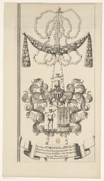
graphic-art, print, engraving
#
graphic-art
#
baroque
# print
#
geometric
#
pen-ink sketch
#
line
#
history-painting
#
decorative-art
#
engraving
Dimensions: height 440 mm, width 269 mm
Copyright: Rijks Museum: Open Domain
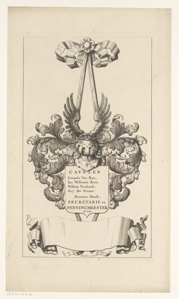
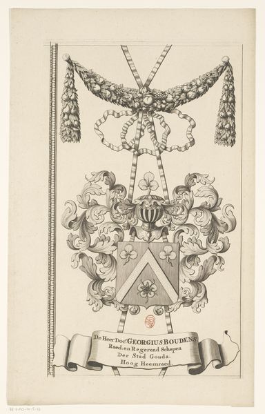
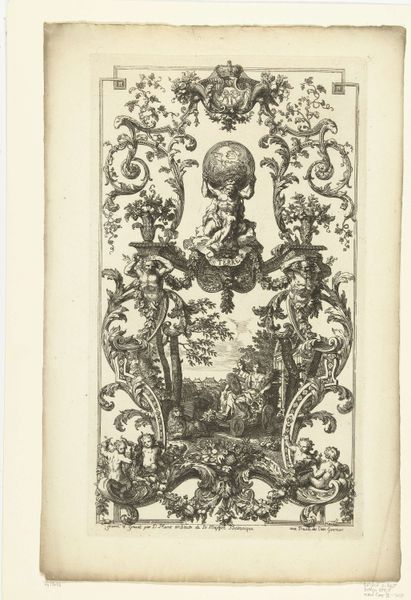
Editor: We're looking at "Kaart van het Hoogheemraadschap van de Krimpenerwaard (deel wapenrand)," dating from between 1683 and 1706, created by an anonymous artist. It’s a print, an engraving. The symmetry is really striking. How do you interpret this work, focusing on its structure? Curator: Observe the rigorous application of line. Note how the artist establishes rhythm. The work invites analysis of its geometry. Is the floral arrangement simply ornamentation, or do the deliberate symmetries propose meaning? Are we presented with a mere arrangement of visual motifs, or the foundations of a deeper semiotic structure? Editor: It feels very formal. Are you suggesting that the geometric and decorative elements communicate beyond just being visually pleasing? Curator: Consider the balance between organic forms, like the leaves, and structured shapes, like the shield and ribbon. Where do the implied vectors lead our eye? The contrast creates tension; what is its function? The success of this piece hinges upon the dynamic interplay between rigid structures and embellished form. Editor: So you're not as interested in what it represents, more about how it's constructed visually? Curator: Precisely. While one may be tempted to interpret this as a map or historical document, I encourage us to decode it via its inherent pictorial mechanisms. Note how negative space serves as both a separation and conjunction to the depicted elements. We are dealing not simply with representational reality but rather the construction of one. Editor: I see. So by focusing on line, shape, and composition, we can appreciate it on a more fundamental level, like its architecture. I hadn’t thought of it that way before! Curator: A beginning perhaps towards true perception.
Comments
No comments
Be the first to comment and join the conversation on the ultimate creative platform.
More like this