oil-paint
#
gouache
#
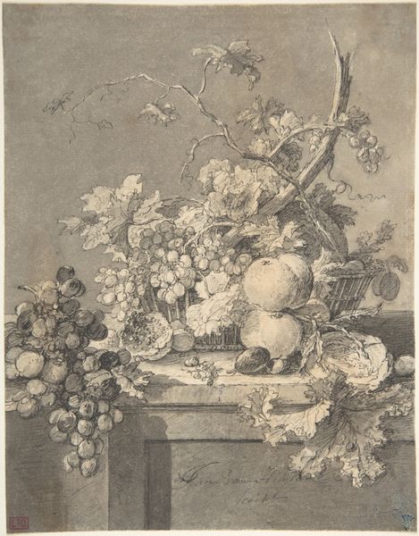
baroque
#
oil-paint
#
oil painting
Dimensions: 54 cm (height) x 41 cm (width) (Netto), 63.2 cm (height) x 51 cm (width) x 5.4 cm (depth) (Brutto)
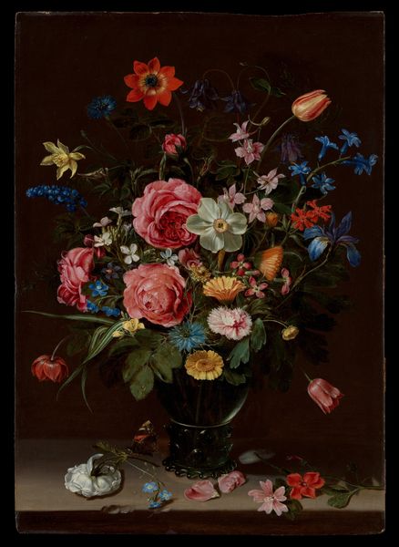
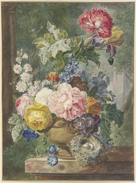
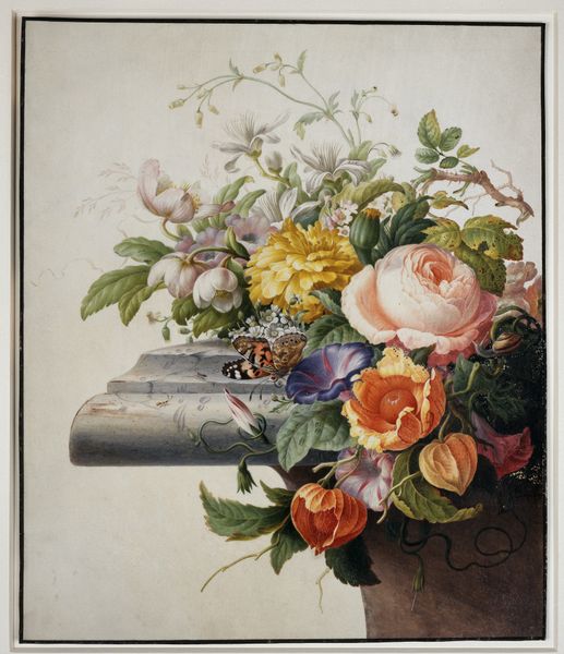
Curator: This still life, titled "Flowers and Fruit," was created sometime between 1650 and 1660. It's currently held here at the SMK, Statens Museum for Kunst. Though the artist remains anonymous, it presents an intriguing study in contrasts. Editor: My first impression is one of contained abundance, almost to the point of overripeness. The deep shadows create a sort of intimate theatre for the profusion of flowers and fruit. Curator: It’s a marvelous example of Baroque aesthetics, marked by a preference for intense color and dynamic compositions. There appears to be a mix of oil paint and perhaps gouache used to achieve such vibrant colors. These pigments wouldn’t have been available to everyone during the time, it suggests a certain degree of wealth from whoever commissioned it. Editor: I see a symbolic commentary on the ephemeral nature of beauty. The roses, symbols of love and passion, contrast sharply with the grapes that could represent excess or the fading nature of summer's abundance. Even the peeled orange could represent an invitation. Curator: You know, I’m particularly interested in the materials themselves, and how their value would have been perceived by contemporary viewers. Were these readily available fruits, or were some of these imported delicacies signifying social status? Editor: Likely a bit of both! This arrangement creates a complex tapestry. The butterfly adds another layer, typically seen as symbol of transformation or even resurrection. A soul emerging, if you will. It lends a certain poignant perspective to the transience you were mentioning before. Curator: Considering the scale, one wonders where it was displayed. Was it a piece for a grand salon, or was it intended for a more private, intimate setting like a dining room or study? The way the textures were rendered; did that translate in various viewing scenarios, and what was lost or gained with certain placement and available light? Editor: Thinking about it further, each element seems chosen not only for its visual appeal, but also for its associated symbolism—a silent language for those who could understand it. It almost operates as a memento mori, concealed within a vibrant scene. Curator: Interesting insight! So much to unpack in a deceptively simple arrangement of flora and fauna! Editor: Absolutely. An engaging dance between symbolism and observation.
Comments
No comments
Be the first to comment and join the conversation on the ultimate creative platform.
More like this