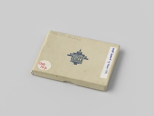
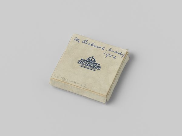
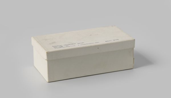
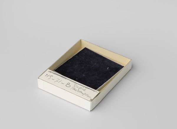
Doos behorend bij een bronzen penning 1965
0:00
0:00
photography
#
product studio photography
#
aged paper
#
homemade paper
#
paper non-digital material
#
book design
#
studio lighting mockup
#
photography
#
book mockup
#
children publication design
#
publication mockup
#
publication design
Dimensions: width 5.8 cm, height 1.1 cm, depth 5.8 cm
Copyright: Rijks Museum: Open Domain
Editor: This is a photograph of a box made in 1965, described as 'Doos behorend bij een bronzen penning', designed for Koninklijke Utrechtsche Fabriek van Zilverwerken van C.J. Begeer. It has such a minimalist, almost austere quality. The muted tones and the centered logo are quite striking. What do you see in this piece from a formalist perspective? Curator: The photograph compels close scrutiny. We might consider the compositional elements at play. The slightly off-center placement within the frame creates a subtle tension, directing the viewer's eye across the surface. Notice the interplay of textures, from the rough grain of the paper to the smoothness of the printed logo. It is within these textural variations, the subtle tonal gradations of the box, and the geometry of the object itself that the essence of this piece resides. How does the interplay of textures strike you? Editor: I find the textures create a sense of depth, contrasting against the flat, neutral background. The almost-invisible handwriting adds another layer, contrasting with the deliberate design of the logo. Curator: Precisely. Semiotically, we may see the box itself as a signifier, a container not just of a physical object, but of history and value. The company logo, a clear declaration of identity, contrasts interestingly with the handwritten additions to the piece, lending it an amateur, intimate feel. Editor: That’s fascinating. I hadn’t considered how the textural and written elements worked together to create such a multifaceted impression. I thought it would have been plain and simple but seeing those extra layers helps. Curator: By examining the structural elements, the intrinsic qualities of the art piece, we gain a more profound appreciation for its complexities. Formal analysis allows us to look beyond the immediate appearance and truly "see" the work in all its intricate design and impact.
Comments
No comments
Be the first to comment and join the conversation on the ultimate creative platform.
More like this