Copyright: Public domain US
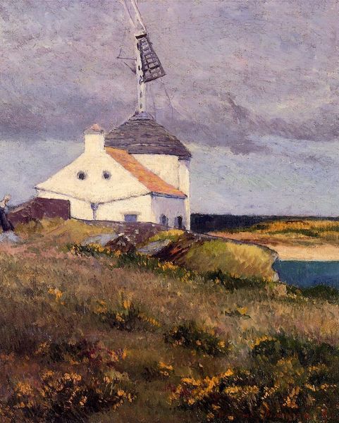
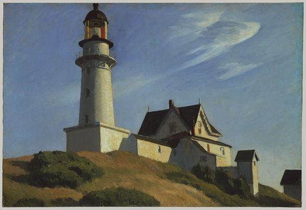
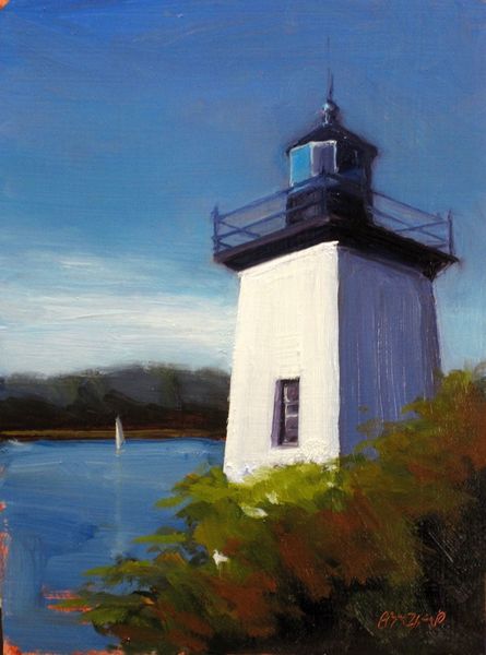
Anita Malfatti made “O Farol” with visible brushstrokes and a daring palette. You can almost feel her process, the way she layered those colours. Look closely at the hill leading up to the lighthouse. See how she’s mixed yellows, oranges, and reds? It’s not just a hill, it’s an explosion of warmth. The paint is applied with such energy, you can practically feel the wind and sun on your face. It’s interesting how she plays with opacity – the lighthouse is solid, but the sky is a swirl of translucent colours. Malfatti was a contemporary of artists like Kirchner and Schmidt-Rottluff, and though you can see a similarity in her use of bold colours, I think her approach is more sensual, less angular. She invites you to feel the landscape, not just observe it, and reminds us that art is more about questions than answers.
Comments
No comments
Be the first to comment and join the conversation on the ultimate creative platform.
More like this