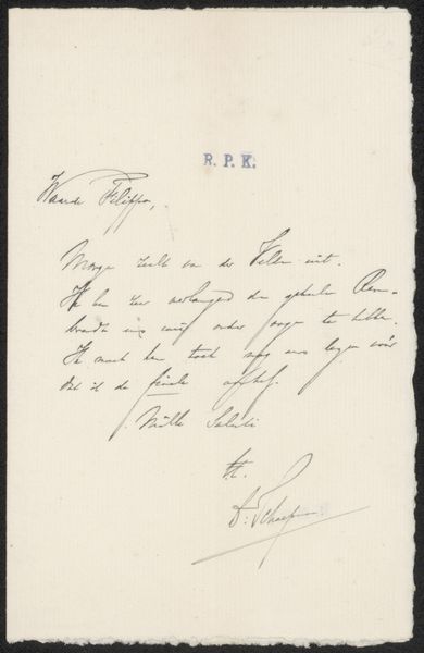
drawing, paper, ink, pen
#
drawing
#
script typography
#
hand-lettering
#
hand drawn type
#
hand lettering
#
paper
#
personal sketchbook
#
ink
#
hand-drawn typeface
#
ink drawing experimentation
#
pen-ink sketch
#
sketchbook drawing
#
pen
#
sketchbook art
Copyright: Rijks Museum: Open Domain
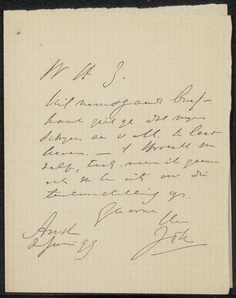
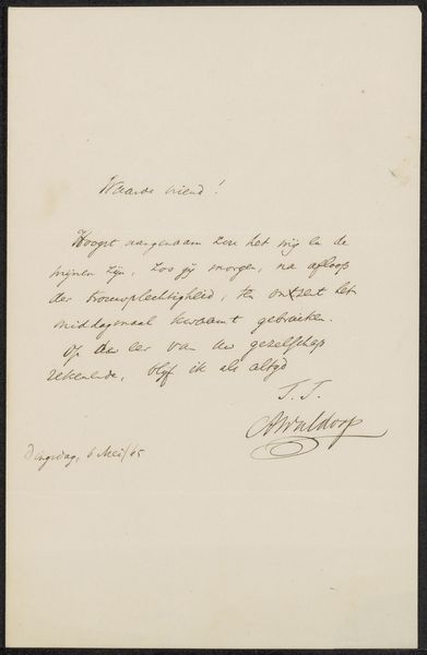
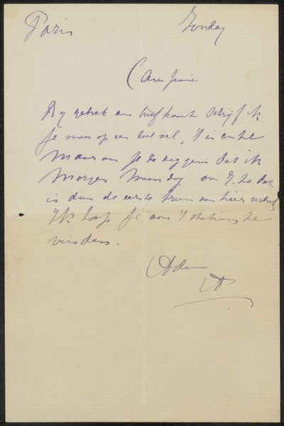
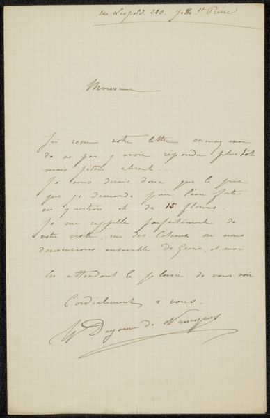
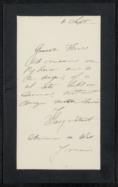
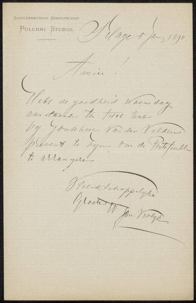
Curator: At first glance, the image feels like a whisper from the past. The elegant script evokes a sense of formality and intimacy. Editor: I agree, there's a definite air of nostalgia. We're looking at a drawing, rendered in pen and ink on paper. The piece is titled “Brief aan Frans Buffa en Zonen,” possibly created around 1878 by Herman Johannes Aloysius Maria Schaepman. Curator: "Letter to Frans Buffa and Sons" -- That’s really telling. This wouldn't be just any correspondence, but potentially an exchange with an influential firm or individual of the time. Its symbolic import could signify class relations and modes of formal exchange, at the turn of the century, through written forms. Editor: Definitely. And consider the handwritten element; each stroke, each flourish suggests the personality of the writer. We can glean insight to understand this individual’s beliefs through this singular document. What I see, with the repetition of ascenders and descenders in the script, feels connected to more widespread conventions, that communicate status and intellectual rigor. Curator: It's interesting to view how the script's rhythm almost operates like a visual signature, distinct but also linked. How does this act as an engagement of power through artmaking? Schaepman creates meaning and exerts control through the act of writing and display within a personal sketchbook. Editor: Exactly! This extends beyond simple legibility. Think of the cultural weight of beautiful penmanship in a pre-digital age. These letters and shapes communicated so much more than their literal message, especially within social, political, and commercial exchange, because it reveals intentionality that extends deeper, beyond an informational exchange. Curator: It’s interesting to view the aestheticization of script as almost an armor: these graphic components denote status and prestige and, even more radically, it almost seems like Schaepman utilizes an intersection of these values to create and negotiate his personal identity and values in a shifting historical context. Editor: Absolutely, it's a reminder of how visual communication can both reflect and actively shape our perceptions, understanding, and identity. It encourages further thought to cultural expectations across history. Curator: Agreed. Exploring the ways individuals and power operate and intersect through visual methods reveals the ability for change and self-definition. Editor: This piece is very effective to invite reflection, to contemplate the nature of letters, symbols, and personal narrative through history.
Comments
No comments
Be the first to comment and join the conversation on the ultimate creative platform.
More like this