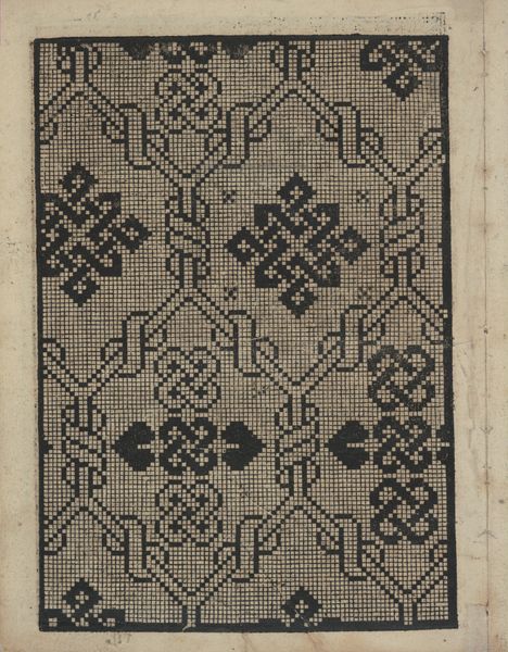
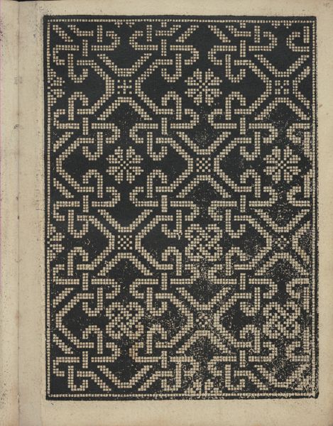
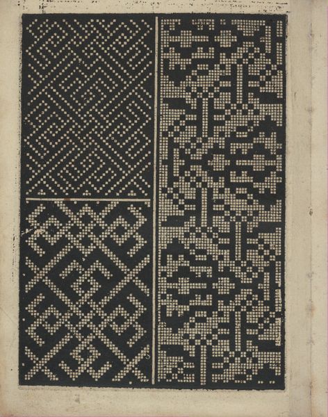
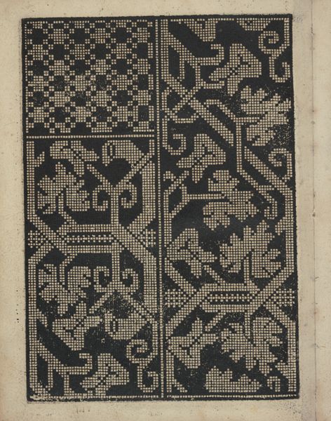
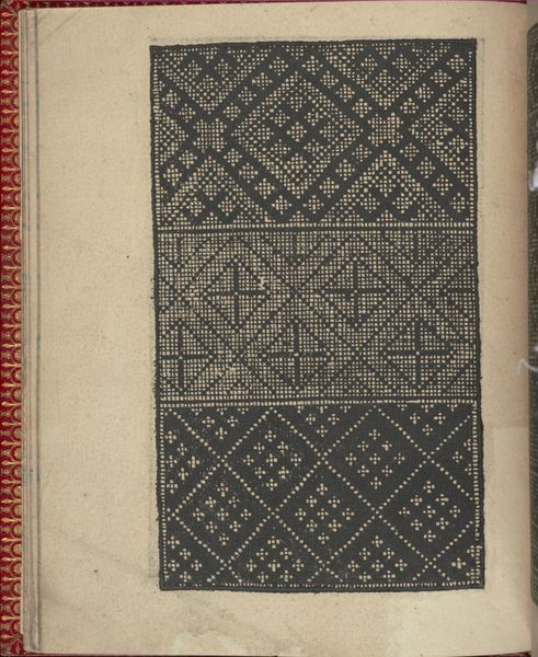
Libbretto nouellamete composto per maestro Domenico da Sera...lauorare di ogni sorte di punti, page 15 (verso) 1532
0:00
0:00
drawing, print, paper
#
drawing
# print
#
pattern
#
paper
#
11_renaissance
#
geometric
#
calligraphy
Dimensions: Overall: 8 1/16 x 6 5/16 in. (20.5 x 16 cm)
Copyright: Public Domain
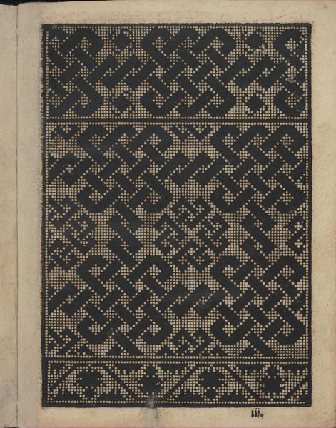
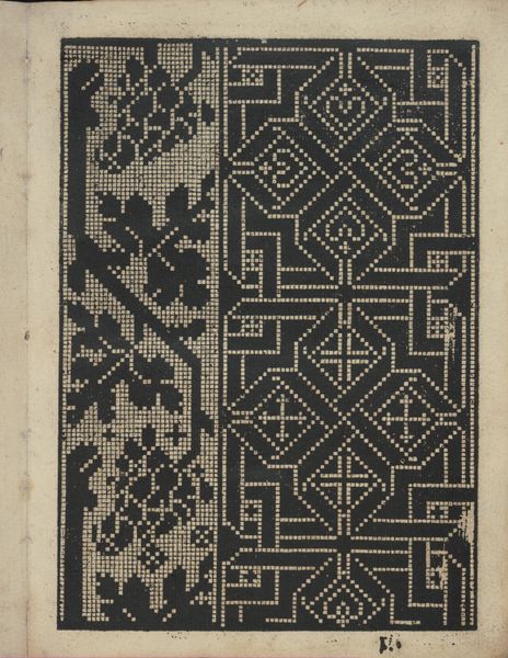
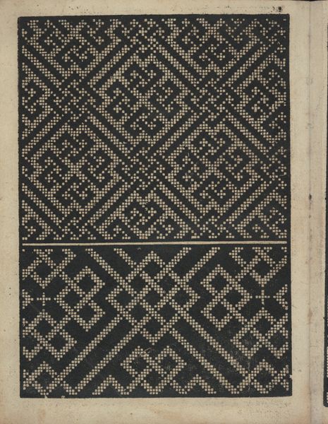
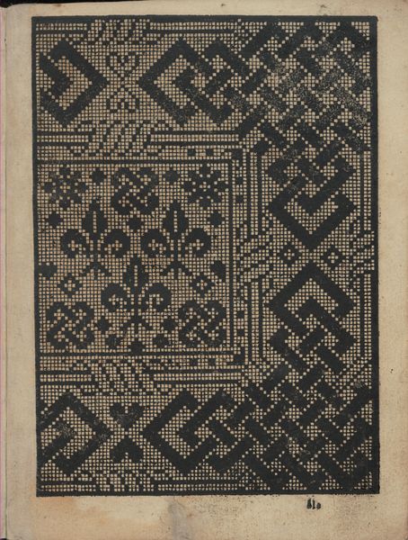
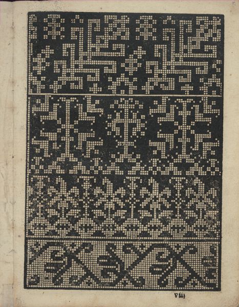
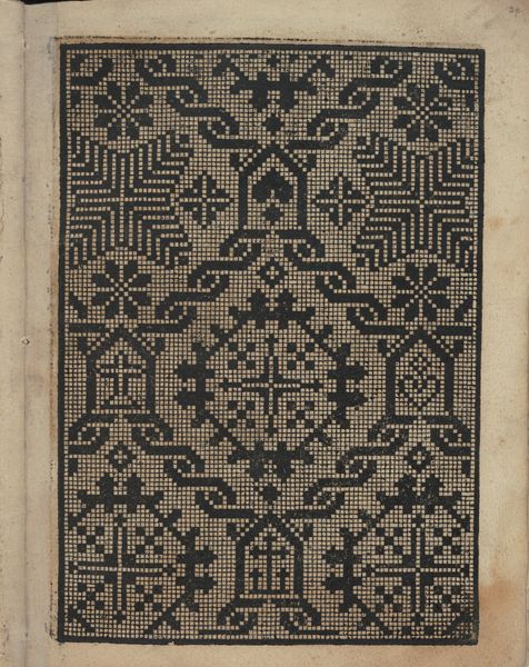
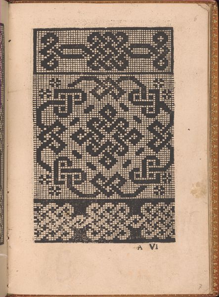
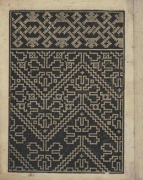
Editor: We’re looking at page 15 from "Libbretto nouellamete composto per maestro Domenico da Sera...lauorare di ogni sorte di punti," created by Domenico da Sera in 1532. It’s a print and drawing on paper. I'm immediately drawn to the intricacy of the geometric patterns. How do you see its formal elements working here? Curator: The dominant formal characteristic is undoubtedly the strict adherence to geometric abstraction. Observe how the artist employs a limited vocabulary of squares, lines, and points to construct complex, yet structured patterns. The deliberate contrast between positive and negative space creates a visually stimulating rhythm. Note, in particular, how the upper and lower sections, while distinct in their specific arrangement, are unified by this shared geometric language and consistent tonality. What do you observe in the relationship between the patterns themselves? Editor: They’re both intricate, but the top one feels more expansive, like a grid extending outwards. The bottom feels more contained and maze-like. I also notice some squares are solid black and some are made up of smaller dots... Is there any relevance? Curator: Precisely. This variation in the rendering of squares – solid versus dotted – serves a crucial function. The solid squares act as anchors, defining the key structural points within the composition, whereas the dotted squares introduce a sense of visual texture and complexity, enriching the surface without disrupting the underlying order. Now, consider the linear quality… how does that affect your perception? Editor: It does make me think about calligraphy! I guess even abstract shapes have lines that flow like letters. Curator: Precisely! Ultimately, Sera utilizes basic graphic elements with the goal of visual harmony in mind. Through line, shape and shade the result invites a calm consideration that mirrors how thought transforms as it transcribes to page. Editor: Seeing this from a formal perspective makes me really appreciate how much the artist could do with something that might initially look quite simple!
Comments
No comments
Be the first to comment and join the conversation on the ultimate creative platform.
More like this