#
neo-pop
Copyright: Modern Artists: Artvee
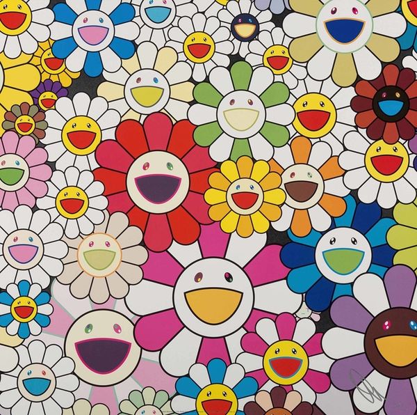
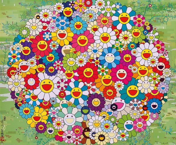
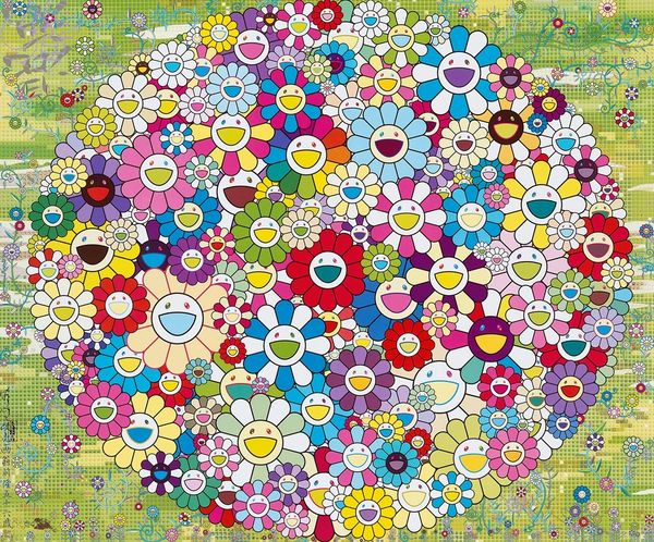
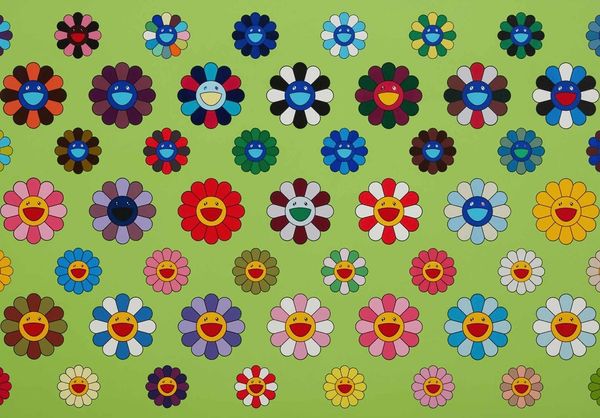
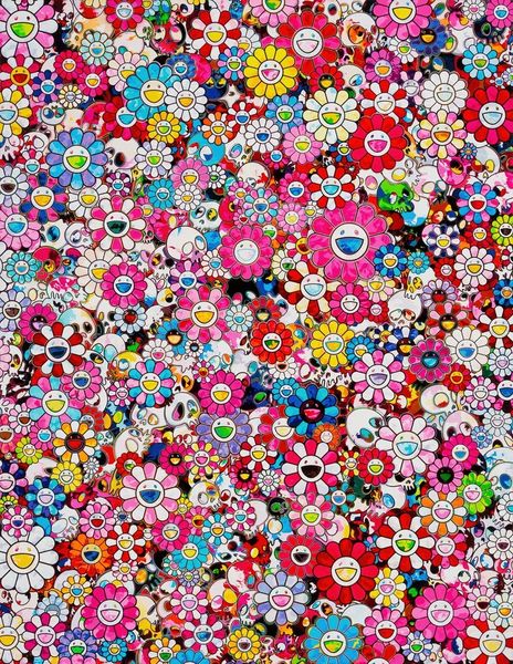
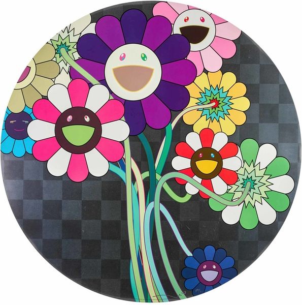
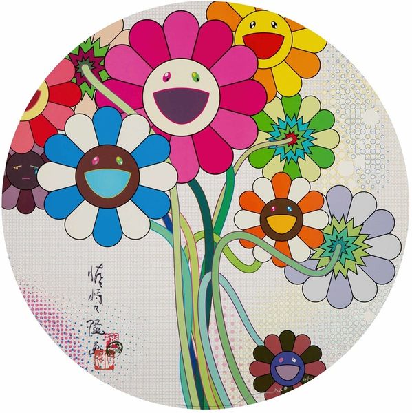
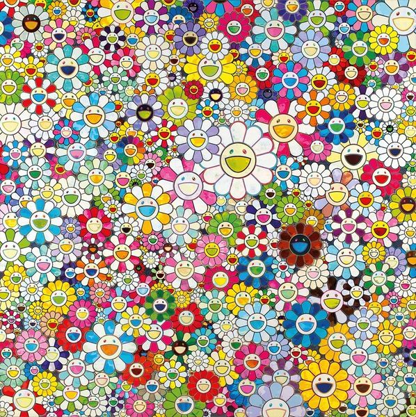
Takashi Murakami made ‘Killer Pink’ sometime in his career using I imagine acrylic paint and maybe some silk screening. What strikes me most is the overall flatness, the way everything is so perfectly rendered, it's like each flower is a little screen, beaming happiness right at you. Look closely, you can almost feel the slickness of the surface. The paint seems applied in these immaculate, uniform layers, devoid of any brushstrokes, as if the artist wanted to completely erase his own presence. But then you notice these tiny details, little imperfections, maybe a slight variation in the color or a barely visible texture, and that’s where the magic happens, the human touch still lingers. The flowers all have very, very big smiles on their faces! The gray background is really what makes the colours in the flowers pop. It reminds me of Warhol's pop art, but taken to this extreme level of detail and finish. It's like he's saying, 'Okay, we can be happy, but we're going to do it in this hyper-real, almost artificial way.'
Comments
No comments
Be the first to comment and join the conversation on the ultimate creative platform.
More like this