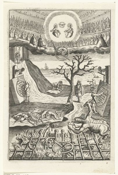
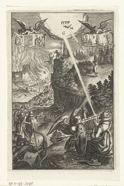
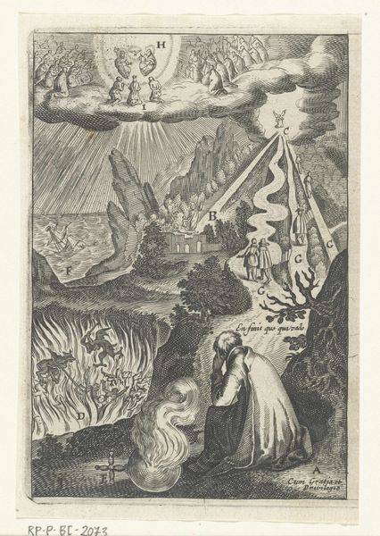
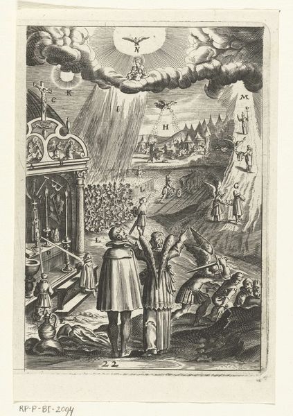
Embleem met man die twijfelt over de keuze tussen leven in deugd of leven in zonde 1620
boetiusadamszbolswert
Rijksmuseum
engraving
allegory
baroque
pen drawing
landscape
figuration
line
history-painting
engraving
Dimensions: height 133 mm, width 94 mm
Copyright: Rijks Museum: Open Domain
Editor: This is “Embleem met man die twijfelt over de keuze tussen leven in deugd of leven in zonde,” created around 1620 by Boëtius Adamsz. Bolswert. It's currently housed in the Rijksmuseum. Looking at this engraving, I am immediately struck by the sharp contrast between the upper and lower sections; the dark and fiery landscape seems to battle with the heavenly skies above. How do you interpret this contrast within the broader composition? Curator: The artist's meticulous line work and division of space generate a powerful tension. Notice the symmetrical arrangement and placement of figures— on the right and the left as mirror images in the center plane, yet differing. Can you perceive any relationship to structuralist principles at work here? Editor: You’re right. There is an inherent symmetry! Both sides display opposing versions of "amor," but with differing landscapes and fates. But structurally, does the linear quality, particularly the stark, thin lines that form each character, influence your perspective? Curator: Indeed. The emphasis on line, a deliberate stylistic choice characteristic of Baroque engravings, establishes the pictorial elements. Also, the tension between line and the implied form creates dynamic contrast— a cornerstone in deciphering the image's content and message. This engraving invites one to consider the binary oppositions ingrained within human decision-making and moral direction, no? Editor: That's fascinating, reflecting how form truly dictates how we perceive a work’s deeper message. The stark linearity enhances that stark contrast in choice! Curator: Exactly. Semiotics, even subconsciously perceived, heightens the artwork's allegorical purpose. Now, the critical question: Has the intrinsic analysis given you insight that the symbolic could not achieve alone?
Comments
No comments
Be the first to comment and join the conversation on the ultimate creative platform.