Dimensions: 185 mm (height) x 225 mm (width) (bladmaal)
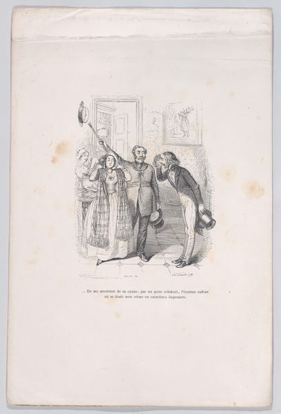
Editor: This is Gerhard Ludvig Lahde’s "Oldtid - nutid no. 2," an engraving from 1821. The print is split in two contrasting scenes, and it feels very… deliberate. The lines are so clean, so different, that it invites reflection. What jumps out at you in the composition of this piece? Curator: The diptych form immediately invites a structural reading. Observe how Lahde deploys contrasting visual lexicons: one side, a celebration of pastoral harmony articulated through curvilinear forms and abundant detail; the other, a stark depiction rendered with harsh angularity and sparse elements. Editor: So, it's not just about what’s depicted, but how? Curator: Precisely. The formal dichotomy underscores the thematic contrast. Consider the implications of the “Oldtid” side: the composition bursts with life, each line contributing to a sense of bucolic vitality. In opposition, “Nutid” employs a near-monochromatic palette, using line sparingly, which conveys decline and isolation. Editor: The "Nutid" side really lacks the bright joyous features of "Oldtid", right? What’s the impact of such difference? Curator: Ask yourself, what semiotic weight do these formal choices carry? How do they function as signs within the larger structure of the artwork? It's through understanding the formal arrangement that the artist articulates his commentary. How else would you interpret the difference in each panels visual construction? Editor: Thinking about the arrangement as a comment itself… I’m starting to appreciate how much the technique shapes the meaning, and it pushes the narrative too. Thank you.
Comments
No comments
Be the first to comment and join the conversation on the ultimate creative platform.
More like this