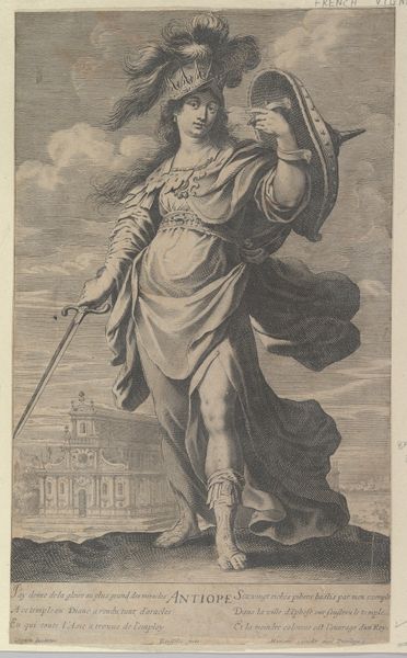
Rhode Island, from the Industries of States series (N117) issued by Duke Sons & Co. to promote Honest Long Cut Tobacco 1889
0:00
0:00
drawing, print, watercolor
#
portrait
#
drawing
#
narrative-art
# print
#
figuration
#
oil painting
#
watercolor
#
watercolour illustration
#
portrait art
#
watercolor
Dimensions: Sheet: 4 3/16 × 2 1/2 in. (10.6 × 6.3 cm)
Copyright: Public Domain
Editor: Here we have "Rhode Island, from the Industries of States series," a print made in 1889 by W. Duke, Sons & Co. It feels very allegorical; I’m immediately struck by the figure’s classical garb, contrasted with what I presume is an industrial backdrop. What can you tell me about its formal qualities? Curator: Indeed. The composition utilizes a clear division between the idealized figure and the implied reality of industrial production. Note the restrained color palette; soft blues, pinks, and reds dominate. The artist employs line and form to delineate the figure with precision. Observe how the textures, especially the drape of the fabrics, create a sense of depth and movement, yet contained within a rather rigid structure defined by vertical column on the left and a block to the lower right. Do you notice any interesting compositional relationships? Editor: Yes, the way the figure’s gaze leads us towards the implied landscape. It's as if the composition directs us from the ideal toward something more... practical? Almost grounded by the text block at the bottom. Curator: Precisely. The tension lies in this visual movement from the symbolic to the concrete. Note also, the use of semiotics – the anchor symbolizing hope, the state's motto. It asks viewers to consider how such values manifest practically. The lines forming the anchor have been delicately tooled to give the impression of solidity. Editor: So, you're saying it's about examining ideals through form? I suppose, then, the contrast reveals an almost uncomfortable connection, yet relies on these beautiful pastel shades. Curator: Precisely! And a very effective use of iconography. A trade card, no less! Editor: This perspective makes me consider how everyday objects employ formal techniques to shape beliefs.
Comments
No comments
Be the first to comment and join the conversation on the ultimate creative platform.
More like this