engraving, architecture
#
baroque
#
old engraving style
#
form
#
line
#
cityscape
#
history-painting
#
engraving
#
architecture
#
historical font
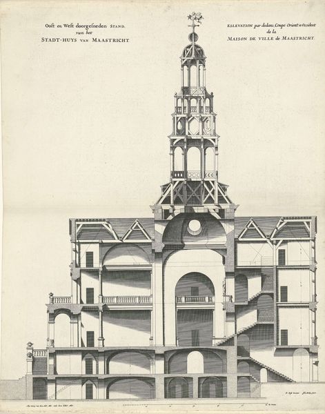
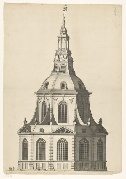
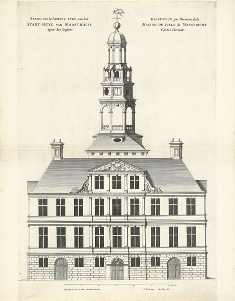
Dimensions: height 492 mm, width 333 mm
Copyright: Rijks Museum: Open Domain
Curator: Here we have Jan Matthysz.’s engraving, “Zuid-noord doorsnede van het stadhuis van Maastricht," created in 1664. It’s a wonderfully precise architectural cross-section. Editor: It's funny, I find it so sterile and diagrammatic that it almost takes on this odd fantasy vibe. It's so skeletal. Curator: I see your point. Its power relies heavily on the formal arrangements of lines and the precise articulation of space. Observe how Matthysz uses varied line weights to denote depth and material differences, a textbook example of Baroque sensibilities. Editor: Sure, Baroque in its complexity but drained of, you know, Baroque flamboyance. It’s like looking at a cutaway of the human body, beautiful in its mechanical perfection but not, let's say, sensual. Curator: Indeed, the very lack of figures emphasizes its functionality as a civic building, doesn't it? Every beam, every arch meticulously rendered. Look at how the arches rhythmically structure the ground level and draw our eye upwards towards the more ornamented levels. It invites us to appreciate the architecture itself, divorced from lived experience. Editor: It definitely feels more like a blueprint than a portrait. All those identical rectangular window shapes…almost gives me an uncanny, "Truman Show" sort of feeling. As if everyone inside is just part of the facade. Curator: Perhaps the intention was to illustrate order and permanence. The placement and duplication of elements lend a powerful, authoritarian essence, even. Consider how the symmetry reinforces its status. Editor: That clock tower! Seriously tall, in an almost comically aggressive, phallic sort of way... I almost expect Salvador Dali’s melted clock to appear slung across the rooftop. Curator: That projection surely distracts from what Matthysz attempted to achieve: a carefully balanced composition communicating the logic and grandeur of municipal design. Editor: Yeah, logic can be sterile and a little soulless too, I suppose. Though its historical artifact, and its existence provides us a glance into what city planning represented at the time. Still a beautiful image overall! Curator: Well said. I think what draws me in further is the balance it achieves by the organization of lines that help you look through time as you also look through its construction.
Comments
No comments
Be the first to comment and join the conversation on the ultimate creative platform.
More like this