drawing, coloured-pencil, watercolor
#
drawing
#
coloured-pencil
#
water colours
#
watercolor
#
coloured pencil
Dimensions: overall: 30.1 x 22.6 cm (11 7/8 x 8 7/8 in.) Original IAD Object: 9 1/4" High 6 1/4" Dia(top) 4 7/8" Dia(base)
Copyright: National Gallery of Art: CC0 1.0
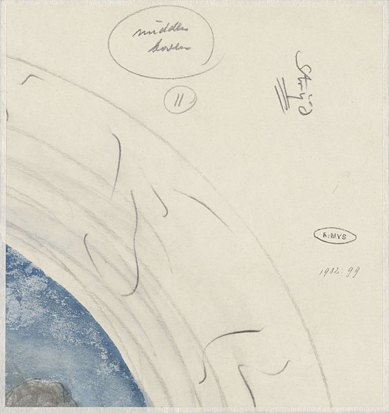
Curator: Yolande Delasser’s work, titled "Crock," was rendered around 1938 using both colored pencil and watercolor. What strikes you about it? Editor: The muted tones create a sense of quiet observation. The stark white of the crock's outline against the softer backdrop makes it seem almost ghostly, floating in the space. Curator: That feeling is enhanced, I think, when considering the cultural context. Pottery, especially everyday objects like this crock, often speak to the domestic labor performed by women in the era it was made. We have a Georgia based woman artist drawing an utilitarian, maybe mass produced item. What stories are absent from its clean, delineated outline? Editor: The contrast between the crisp rendering of the pot and the more blurred, textural depiction of the emblem definitely draws the eye. Semiotically, the emblem functions as a kind of anchor, grounding the piece in its materiality, pointing us to a world of touch and form that the bare pot shape denies. It's really quite sophisticated compositionally, given it uses just colored pencil and watercolors. Curator: The addition of "Howe & Clark Athens" speaks directly to labor and manufacturing—placing the vessel in a network of economic exchange. It's interesting to consider how this representation of craft mediates Delasser's position as an artist – does she identify or distance herself from the labour implied? And consider Athens at that time, rural life against a growing manufacturing base and also, deeply entrenched Jim Crow practices. How might that have influenced her choices as a maker? Editor: You know, I was so busy noticing the juxtaposition of line and tone, of empty space and density, that I hadn't even started down that interpretive path. However I think we cannot discount those important nuances either. Perhaps, in choosing a simple form rendered with what looks like straightforward application of the mediums, Delasser seeks clarity. Curator: Perhaps she is simply representing what she sees! But the choices an artist makes always have some reflection on their identity. I am glad that we came to this interesting synthesis of how we might perceive it differently. Editor: Me too! Thanks for sharing your thoughts.
Comments
No comments
Be the first to comment and join the conversation on the ultimate creative platform.
More like this