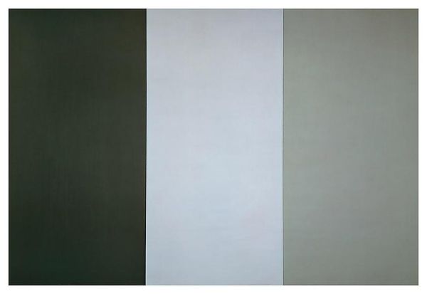
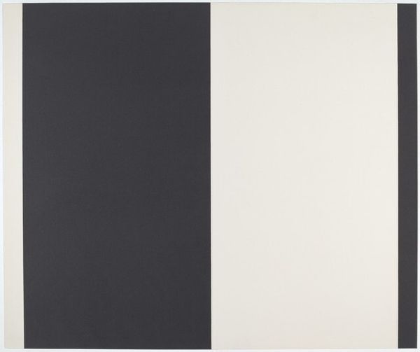
painting
#
painting
#
minimalism
#
colour-field-painting
#
rectangle
#
geometric
#
abstraction
#
hard-edge-painting
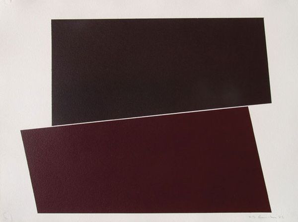
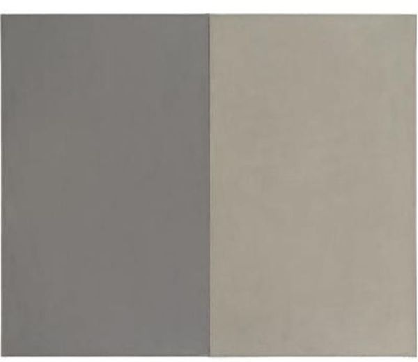
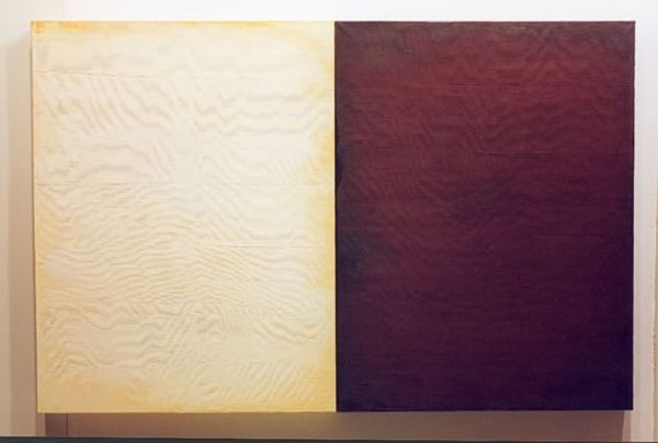
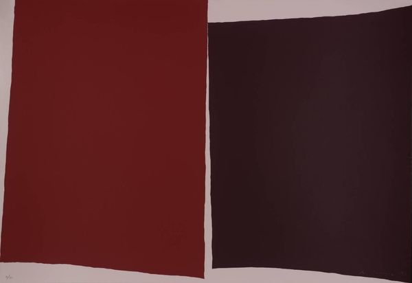
Copyright: Gianni Piacentino,Fair Use
Gianni Piacentino’s “Responsive Eye” juxtaposes two blocks of color: a deep, muted burgundy against a pale, almost ethereal, beige. These colors, seemingly simple, evoke a rich symbolic history. The dark hue echoes the somber tones found in centuries of mourning attire and religious iconography, representing introspection and contemplation. Beside it, the light beige recalls the sun-drenched walls of ancient temples, symbolizing purity, enlightenment, and the dawn of understanding. This duality is not new. We see similar contrasts in Byzantine mosaics, where dark, powerful figures are set against radiant gold backgrounds. The color pairing creates a dialogue, a visual push and pull that resonates with our deepest emotional experiences. Color theory suggests that the contrast affects the viewer's perception and emotional responses. It's a visual echo of the ancient alchemical quest to reconcile opposing forces, a quest that continues to resurface in art, philosophy, and the very fabric of our collective memory.
Comments
No comments
Be the first to comment and join the conversation on the ultimate creative platform.
More like this