Copyright: Public domain
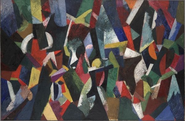
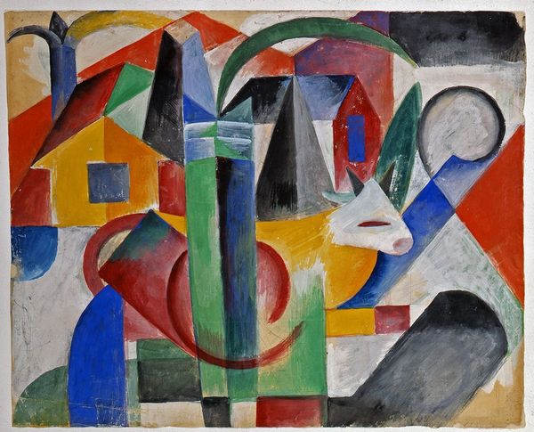
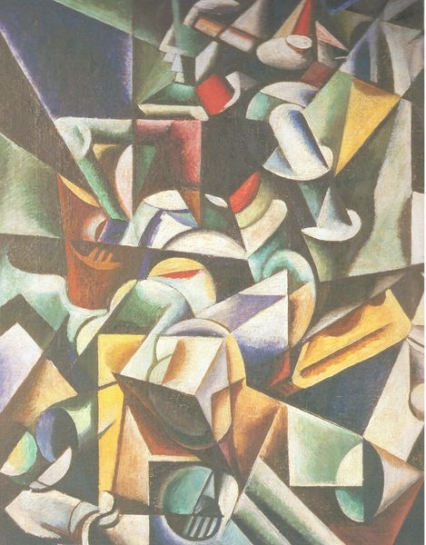
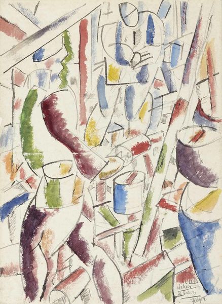
Editor: Here we have Patrick Henry Bruce's "Composition V" from 1916. It is an oil painting, and the shapes and colors are quite striking. It feels almost chaotic in its arrangement. How would you interpret this work, focusing on its formal elements? Curator: The painting presents a fascinating study in contrasting forms. Notice how Bruce employs geometric shapes, circles, rectangles, triangles, which vie for space on the canvas. The color palette—primarily reds, blues, greens, and blacks—is bold, creating a sense of tension and dynamism. How do you perceive the relationship between these color choices and the overall structure? Editor: I think the dark colors help define the forms and create some depth. Are those relationships accidental, or is Bruce aiming for something deeper than just presenting shapes? Curator: That's astute. It's less about external reference and more about exploring internal relationships. The brushstrokes, although seemingly haphazard, reveal a considered layering and blending. It is precisely this interplay that signifies its artistic endeavor—an inquiry into the potential for pictorial construction independent of representational obligations. We may even delve into Semiotics, where colours, brushstrokes, the geometric shapes serve as signifiers of emotions and ideas and challenge you, the viewer, to connect the various components of the painting together and formulate our unique interpretations. What is your interpretation? Editor: I am trying to think about the colour composition now, maybe its his reflection on social events occurring at the time... The shapes are wrestling with one another to show their presence, that bold colour selection has even more weight than it would alone. Curator: A good reading; although subjective interpretations cannot be ruled out, they lie outside formal assessment. Do consider revisiting to assess how internal elements create a self-referential system divorced from time. Editor: Thanks; I realize I was drawn in by its colour. Thinking about colour is useful. I’m eager to reconsider it focusing more narrowly on his brush strokes now.
Comments
No comments
Be the first to comment and join the conversation on the ultimate creative platform.
More like this