drawing, paper, ink, pen
#
drawing
#
hand-lettering
#
hand drawn type
#
paper
#
personal sketchbook
#
ink
#
hand-drawn typeface
#
ink drawing experimentation
#
pen-ink sketch
#
ink colored
#
pen work
#
sketchbook drawing
#
pen
#
sketchbook art
#
calligraphy
Copyright: Rijks Museum: Open Domain
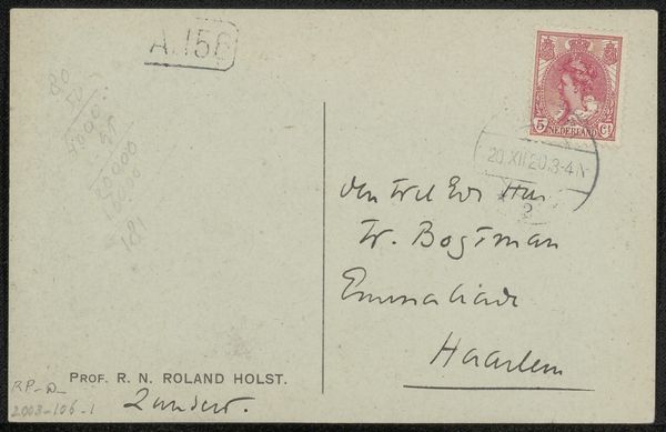
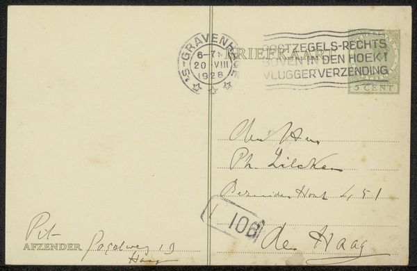
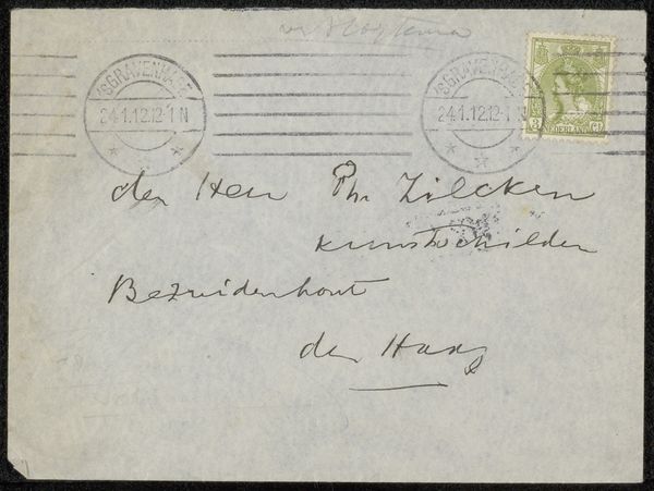
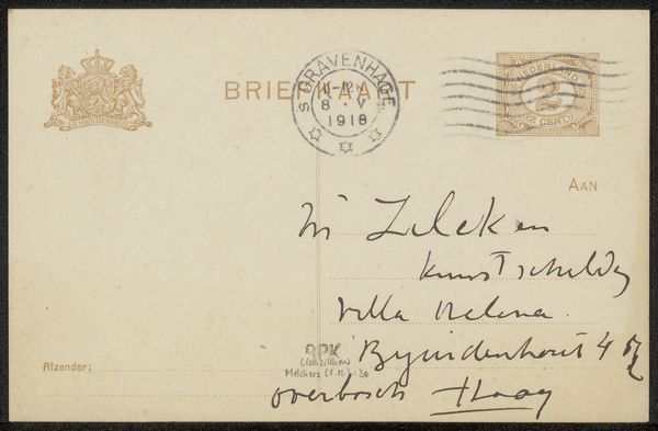
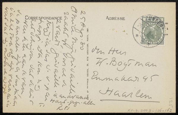
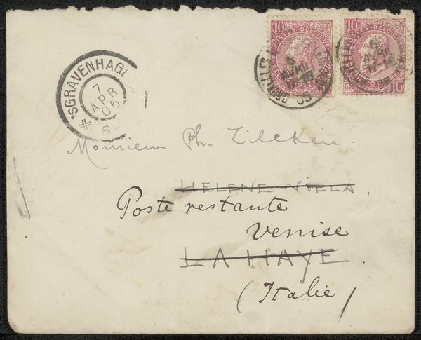
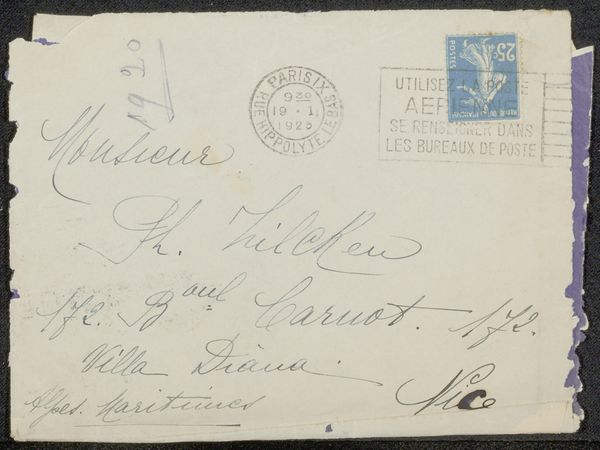
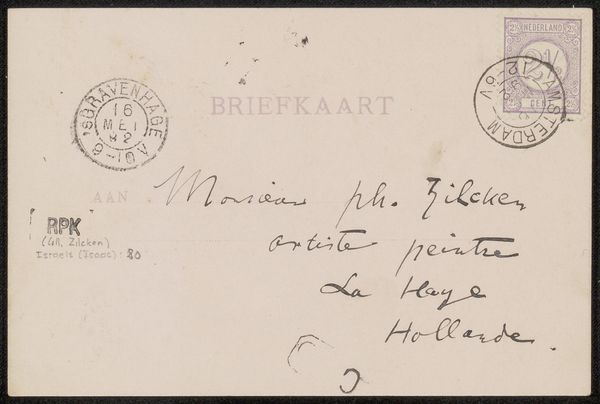
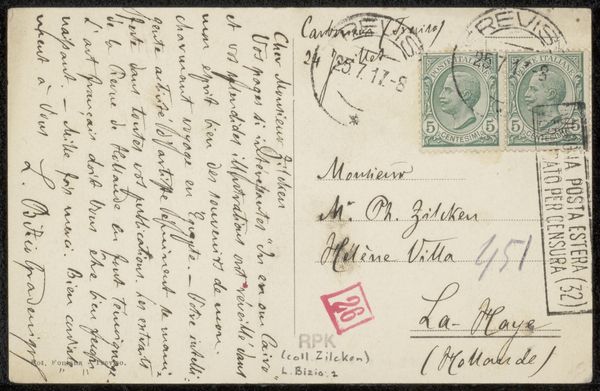
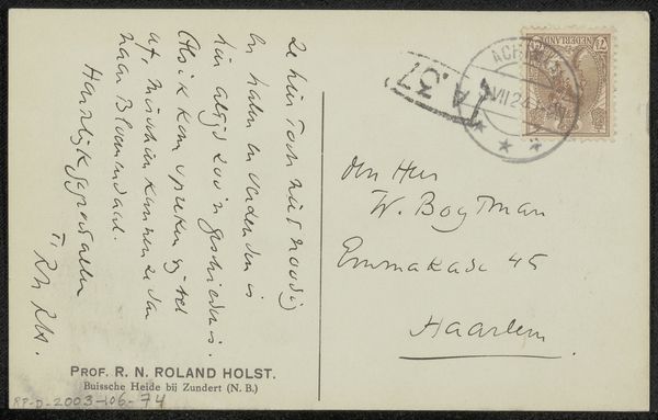
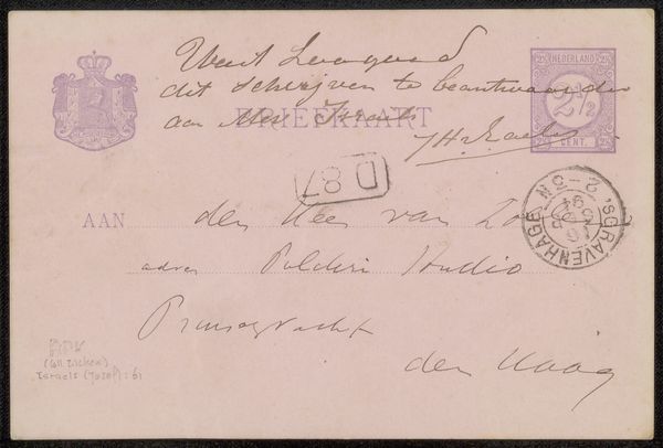
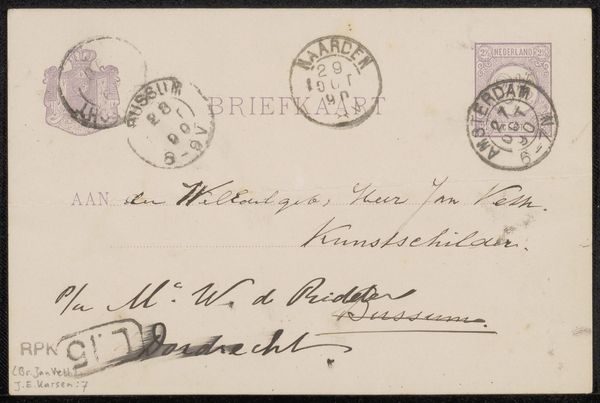
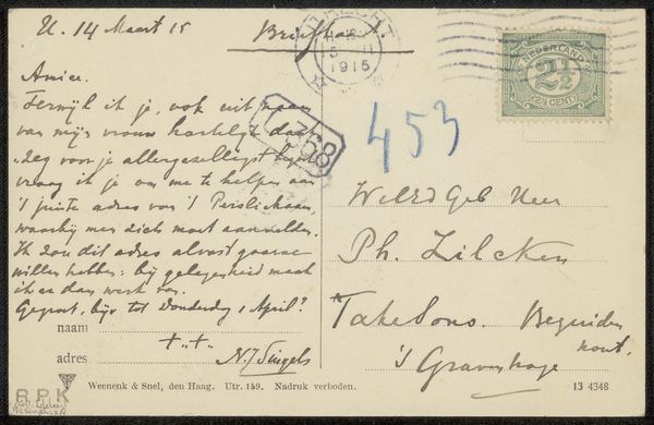
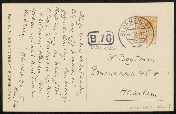
Curator: Here we have an envelope addressed to Philip Zilcken by Baronne Madeleine Deslandes, dating to before 1899. It's crafted using ink on paper, primarily a pen and ink drawing. My immediate reaction is drawn to the graphic quality of the script, the deliberate use of line weight, and the rhythm established across the composition. Editor: It gives a peek into the very tactile, slow exchange of communication of that era, so distinct from our digital speed now. Envelopes like these weren't just containers; they were artifacts touched by many hands from the Baroness herself to the postal workers, carrying social connection with the weight of labor and tangible form. Curator: Precisely. Look at the nuances in the handwritten text. The flourish of "Monsieur," the straightforward lettering of the address... there's a conscious arrangement of form and a sophisticated awareness of positive and negative space at work here. Editor: I find the materiality so evocative. The slightly rough texture of the paper, the dark ink that's probably acidic, slowly eating away at the fibers... Each choice, like the particular nib of the pen or the brand of ink used, tells a silent tale about the conditions of its production. Think about who supplied that stationery to the Baronne. Curator: One might even argue the postal stamp is an integral design element. See how its circular shape contrasts with the rectangular format, its colors adding subtle visual interest. It enriches the overall aesthetic dynamic. Editor: Beyond aesthetic decisions, there is labor indicated by that postal stamp, think of the processes involved—the mining of materials, the printing, distribution and eventual use. An underlayer to what might seem like a simple drawing, is actually an intricate set of material practices that define artistic expression. Curator: Absolutely. The act of selecting paper, choosing a pen, mixing ink... all of it contributing to the semiotic richness. Every mark holds meaning within the larger structure. Editor: These considerations remind us art is also industry; materials and the processes of its making carry inherent biases from economic systems to social relationships. We have much to gain by giving more significance to this tangible labor of producing work in its historical context. Curator: That perspective does highlight the complexity of even seemingly simple objects. It encourages a more profound encounter. Editor: Indeed, it moves us toward understanding artworks not in isolation but deeply interconnected within their web of material origin and means of production. Thank you for shedding light on the design, the graphic power inherent in that, though. It balances a focus to the socio-economic factors as well.
Comments
No comments
Be the first to comment and join the conversation on the ultimate creative platform.
