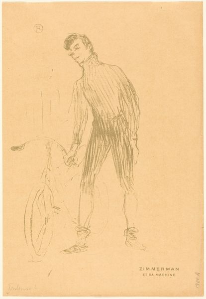
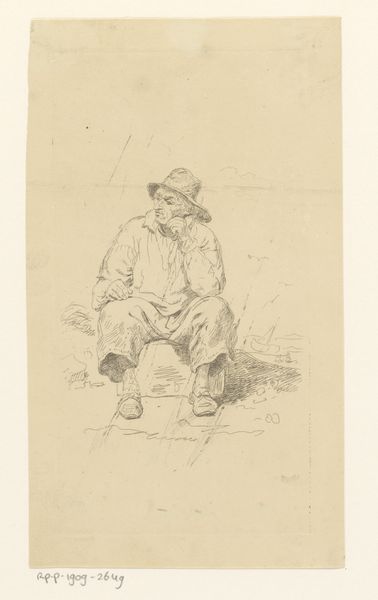
drawing, pencil
#
portrait
#
drawing
#
light pencil work
#
pencil sketch
#
asian-art
#
figuration
#
personal sketchbook
#
idea generation sketch
#
ink drawing experimentation
#
pen-ink sketch
#
pencil
#
sketchbook drawing
#
pencil work
#
storyboard and sketchbook work
#
sketchbook art
#
realism
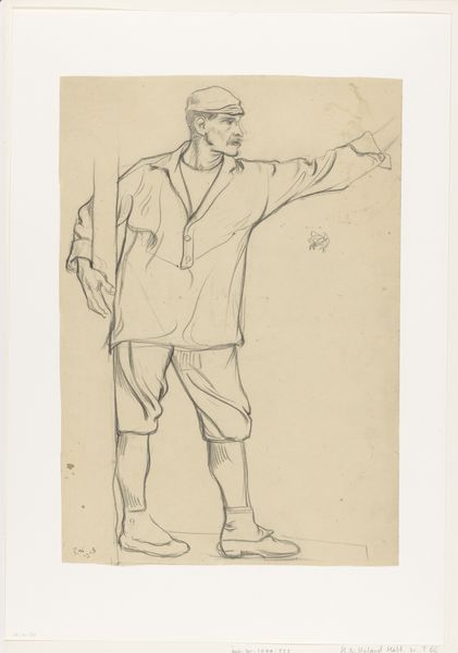
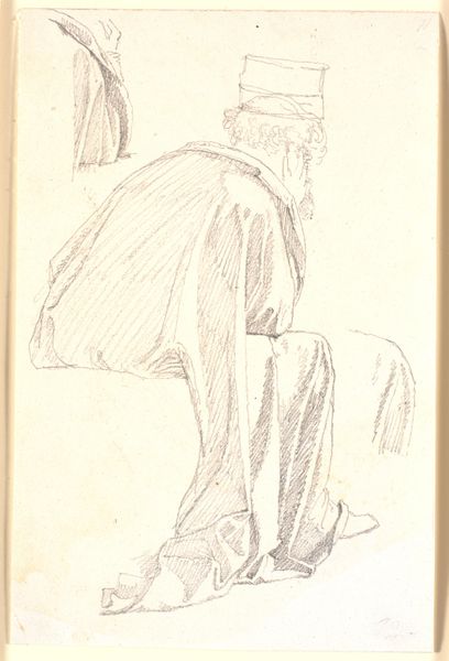
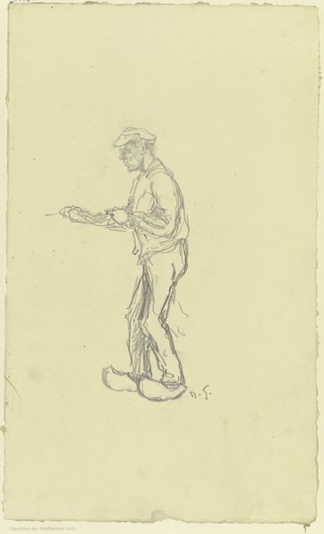
Dimensions: height 284 mm, width 220 mm
Copyright: Rijks Museum: Open Domain
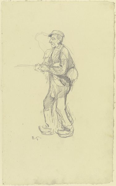
Editor: This is "Zittende Indonesische man, mogelijk Amit," or "Seated Indonesian Man, Possibly Amit," a pencil drawing by Willem Witsen, likely from between 1920 and 1924. It’s interesting how simple and understated it is, just a man sitting, but there's something very intimate about it. What do you notice about the formal aspects of the piece? Curator: Precisely. Focus on the economical use of line. Witsen masterfully captures form and shadow with a limited tonal range. Note the directionality of the pencil strokes, employed to build volume and delineate the figure from the ground. Consider the compositional balance, or lack thereof, how does the off-centered figure affect your reading? Editor: It does give it a more casual, informal feel. It's not posed in the way you might expect of a formal portrait. The sketchiness almost feels like you are looking over the artist’s shoulder. What do you think is achieved through this choice of materiality? Curator: The medium facilitates immediacy, it conveys a sense of fleeting observation. Pencil allows for subtle gradations in tone and texture, vital for rendering the nuances of light on the subject's skin and clothing. The lack of color reduces the image to its essential elements: form, line, and shadow. Does this distilled representation alter your understanding of the sitter? Editor: It does make you focus on the shape of his posture, and the details like the headscarf and his hands. The limited colour palette encourages a focus on the form. It highlights the structure. I also like how much of the page has been left untouched - that brings your attention to the detail included. I see that! Curator: Yes, and we may consider that within semiotic framing: Absence becomes as expressive as presence, informing our reception of the artist's subject. The simplicity amplifies the expressiveness of what remains. It encourages us to examine closely what the artist elected to convey. Editor: That's a really helpful way of putting it; seeing the drawing not just for what’s there, but for what isn't, and how that absence shapes the overall meaning and focuses our eye on what matters most. Thanks.
Comments
No comments
Be the first to comment and join the conversation on the ultimate creative platform.
More like this