print, etching
narrative-art
etching
genre-painting
history-painting
Dimensions: height 236 mm, width 188 mm
Copyright: Rijks Museum: Open Domain
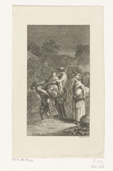
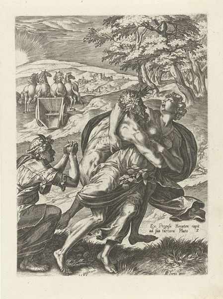
Curator: This etching, attributed to Emrik & Binger around 1877-1879, is called "Spotprent op de bisschop van Munster, 1672," which translates to "Caricature of the Bishop of Munster, 1672." It is held in the Rijksmuseum's collection. Editor: My immediate sense is one of… exhaustion. There’s a weariness etched into the composition itself, the way figures seem to droop and trudge along. Curator: Observe how the engravers at Emrik & Binger use hatching and cross-hatching to define the volumes and textures, particularly the clothing and foliage. Note how the contrasting areas of light and dark draw attention to the bishop. Editor: Yes, but that bishop is hardly presented as a figure of divine authority. Burdened, mocked—what narrative are the artists constructing through this portrayal? Is this about the weight of religious authority, or perhaps a pointed critique of the Bishop of Munster’s historical role? Curator: Consider the linear quality of the print; how each figure is outlined with precision and a certain flatness, which lends a deliberately antiquated or stylized feeling, and what sort of expressive effects the etchers are achieving with it. Editor: The child, or dwarf, at the front strikes me. With the owl perched on their head, the dog nipping at their heels—is this an attempt at humor, or commentary? The composition hints at an unraveling hierarchy, with the bishop looking less like a leader and more like an over-burdened traveler, trailing the motley entourage. The viewer’s vantage emphasizes not piety but precariousness. Curator: The etchers really exploit the stark contrast, the opposition between areas of intense shading and areas of blank paper, but the balance in values makes the scene feel surprisingly harmonious, too. Editor: What’s harmonious is how acutely it depicts power losing grip, really. Thank you for guiding me through that--it helped make sense of this tableau! Curator: My pleasure. It’s these subtle compositional details that yield meaning, and the etcher’s mastery is clear when you look at it.
Comments
No comments
Be the first to comment and join the conversation on the ultimate creative platform.