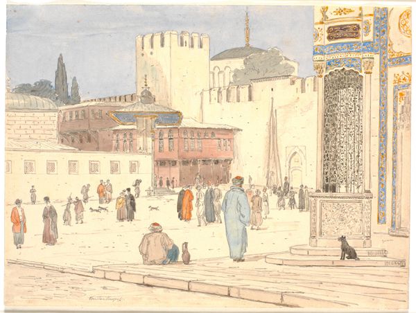
painting, watercolor
#
painting
#
impressionism
#
landscape
#
watercolor
#
orientalism
#
cityscape
Copyright: Public domain
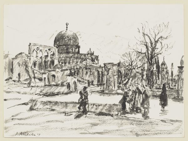
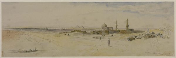
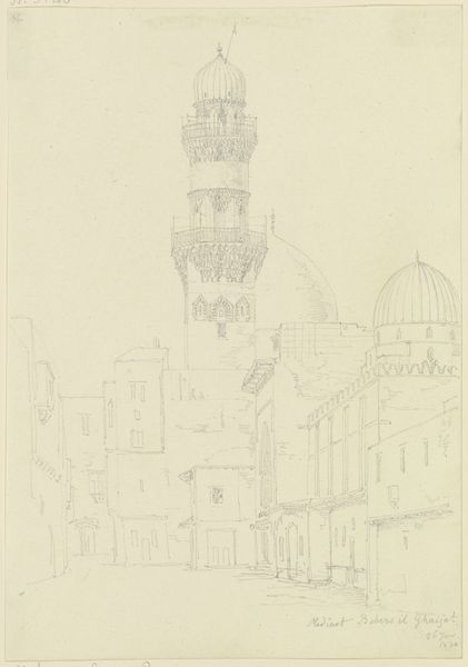
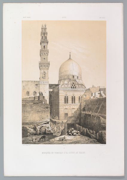
Curator: Before us is "Arches" by Konstantin Gorbatov, an evocative city scene rendered in watercolor, dating from 1935. Editor: My first impression is the hazy atmosphere, a feeling of distance, achieved through subtle layering of tones. Curator: Indeed. Gorbatov's work frequently draws upon orientalist themes, particularly architecture and bustling marketplaces, seen through a lens of Russian impressionism. The "Orient," so often romanticized, provided fertile ground for exploration of cultural difference, power dynamics, and artistic identity for many European artists of the time. How might we understand Gorbatov's place within this discourse? Editor: By looking at his technique, perhaps. See how he uses a limited palette and soft lines. This isn't about precise representation, but more about capturing the essence, a certain feeling, a subjective reading of this place. Curator: Precisely. We must acknowledge the socio-political contexts inherent in his aesthetic choices. For instance, consider the way Gorbatov focuses on the 'exotic' marketplace—a place of transaction but also potential exploitation and encounter, and consider the politics implicit in that gaze. Is he complicit in the orientalist fantasy, or does he offer a more nuanced perspective through the softened rendering? Editor: His technique makes that problematic gaze rather benign. Note the emphasis on composition, on how those arches create a sense of depth, leading the eye toward the minarets and domes in the background. This geometrical framing really dictates how one’s attention flows through the image. Curator: True, and yet we must ask who this ordered composition is designed for. Who is invited to gaze upon and consume this exotic vision? That matters, as it’s often central to understanding the social narratives embedded in the work. Editor: Maybe. But I still think we're giving him too much credit to begin with. Let's keep our minds on his semiotic use of color. He contrasts the cool washes with pops of reds in the foreground that creates an area of strong visual interest—regardless of underlying meaning. Curator: These points, while disagreeing slightly, together add to the appreciation of this watercolor. Editor: It does so for me too, actually.
Comments
No comments
Be the first to comment and join the conversation on the ultimate creative platform.
More like this