Copyright: Julian Opie,Fair Use
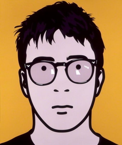
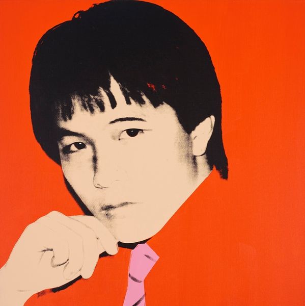
Editor: Here we have Julian Opie's "Dave Rowntree" from 2000, made with acrylic paint on glass. It’s so striking—the stark lines and flat planes of color. It almost feels like a digital rendering, even though it’s painting. What do you see when you look at this portrait? Curator: Formally, this work showcases Opie's keen interest in simplification and reduction. The lines, consistently bold and black, operate as both contour and boundary, defining shapes of colour within the glass. Observe how detail is minimised; facial features are rendered as geometric forms. The glasses, in particular, demonstrate how shape and repetition contribute to a unique aesthetic. Editor: So, the impact comes from what’s left OUT rather than what’s put in? Is there a sense of depth or flatness, or something in between? Curator: Exactly. And to address the depth, notice the pink background is completely flat, contrasting the figure which has very slight modulations to imply light and shadow. The acrylic on glass medium heightens this effect; the light interacts with the paint in a specific way that contributes to our reading of depth, although a very shallow depth, I grant you. Editor: It's fascinating how such a minimalist approach can still convey a sense of character. I hadn't considered how much the medium itself contributes to that effect. Curator: Indeed. Consider how these formal elements – line, shape, colour, medium – come together to create a portrait that is simultaneously modern and iconic. A careful construction for the viewer to decipher the relationships present. Editor: Thanks, that's given me a whole new perspective on reading Opie's work, looking closely at how the forms build the bigger picture.
Comments
No comments
Be the first to comment and join the conversation on the ultimate creative platform.
More like this