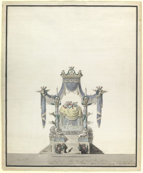
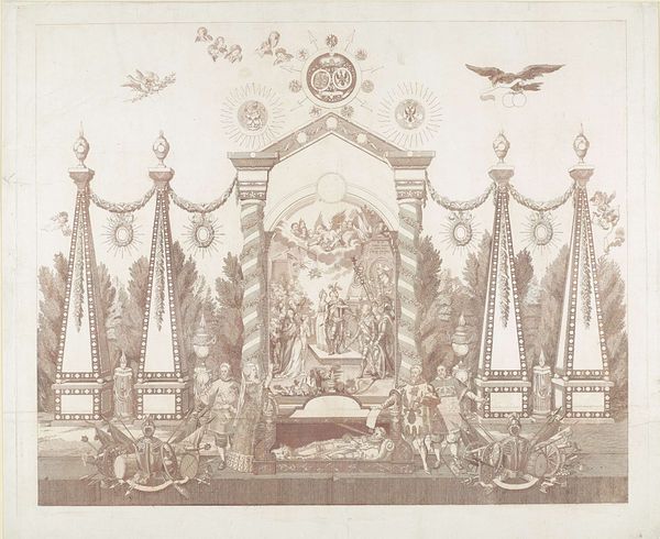
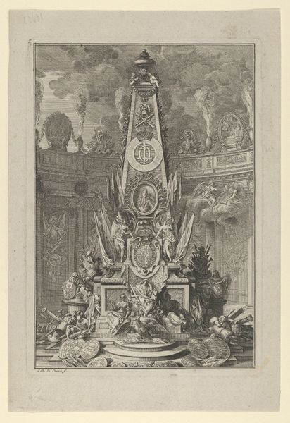
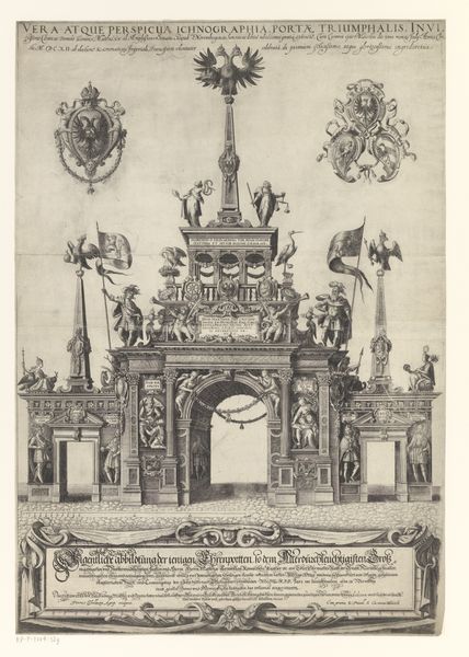
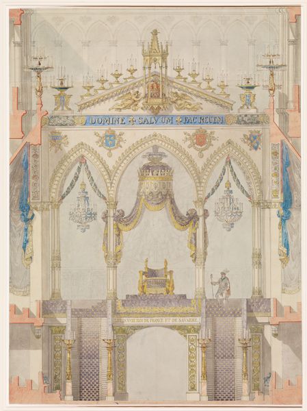
Catafalque of the Empress Catherine the Great of Russia (Side Elevation). 1796
0:00
0:00
drawing, coloured-pencil, print
#
drawing
#
neoclacissism
#
coloured-pencil
# print
#
coloured pencil
#
pen and pencil
#
watercolor
Dimensions: sheet: 28 1/4 x 23 3/8 in. (71.7 x 59.4 cm)
Copyright: Public Domain
Curator: Ah, yes, "Catafalque of the Empress Catherine the Great of Russia (Side Elevation)" conceived in 1796 by Vincenzo Brenna. Look at the sheer monumentality rendered in pen, pencil, and watercolor! What's your initial read of it? Editor: Foreboding, actually. And oddly airy for something about death. All that white space around a rather extravagant, neoclassical display of grief, or rather, mourning. The colour is restrained, not really funereal in the typical sense, what do you make of the staging? Curator: For Brenna, staging was everything, a chance to sculpt the collective memory. Those precise lines! Neoclassicism reaching for immortality through perfect form. I sense an effort to render power and, well, control through order. Even in death. Editor: Absolutely, power. Check out the symmetry—mirrored cherubs, paired busts—the insistent repetition. Is there some significance in its incompleteness though? It doesn’t look quite finished. The etching looks faded. Curator: Perhaps that enhances the emotion, creates a visual incompleteness in this space that gives room for interpretation? It also seems to underscore Catherine's unfinished business, perhaps even Russia's ongoing transition? Editor: Hmm, transitions. So that’s like these angelic figures looking like they’re ushering her into the afterlife or some sort of spiritual transcendence. This drawing captures something deeply ambivalent. It’s not simple mourning, but really a celebration, a stagecraft that seems so distant from intimate grieving. It’s so stylised! Curator: Agreed, Brenna, always thinking of posterity! And the composition leads your eye directly to what would have been her remains in state. Every detail, from the friezes along the base to the swagged drapery, speaks to empire. All in these very subtle colours, though, and it feels so different from what I was expecting, it looks more celebratory and a less obviously emotional representation. Editor: That is its beauty though, how this architectural proposal encapsulates this transitional period of life and legacy through perfect geometry and carefully placed symbolic touches, it’s really clever. Curator: It certainly prompts a dialogue, doesn't it? Between grandeur and the personal void.
Comments
No comments
Be the first to comment and join the conversation on the ultimate creative platform.
More like this