#
aged paper
#
traditional media
#
joyful generate happy emotion
#
personal sketchbook
#
illustrative and welcoming imagery
#
illustrative and welcoming
#
watercolour illustration
#
cartoon carciture
#
sketchbook art
#
cartoon theme
#
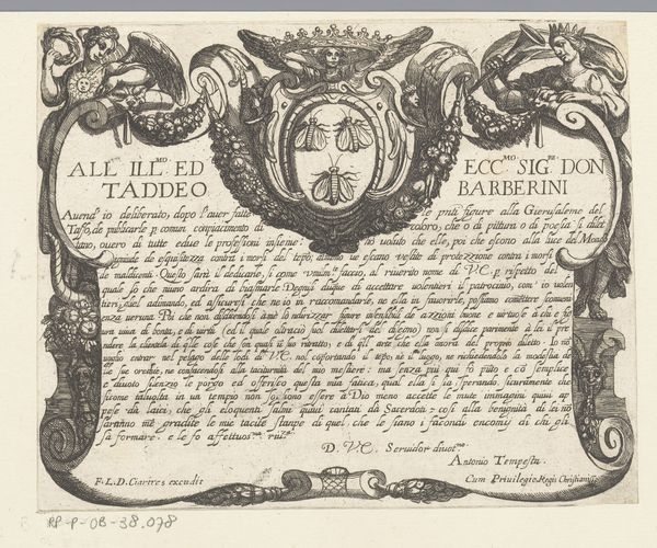
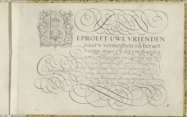
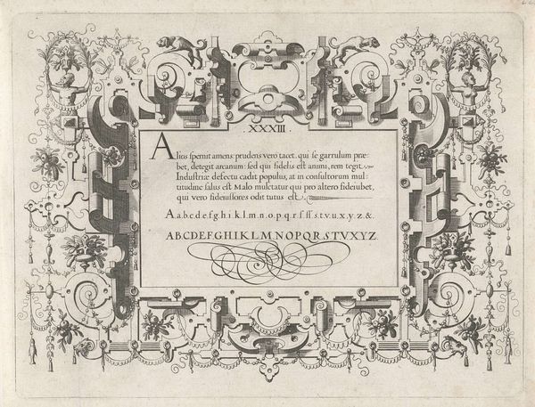
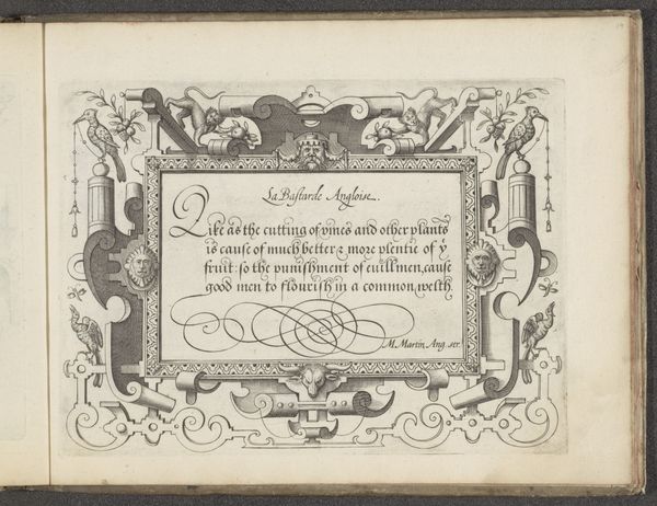
calligraphy
Dimensions: height 156 mm, width 220 mm
Copyright: Rijks Museum: Open Domain
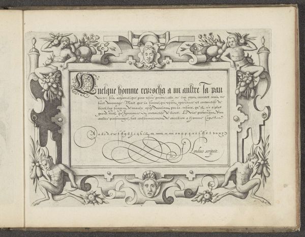
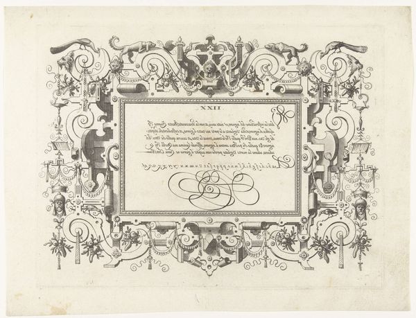
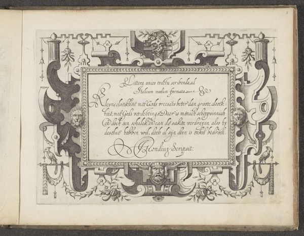
Curator: This is a fascinating calligraphic cartouche by Jodocus Hondius, dating back to 1594. Notice the detailed border with those... odd figures? Editor: My eyes are drawn to the symmetry, or deliberate asymmetry. The grotesque figures—are they devils or fauns?—framing the central text. There's a real tension between the beautiful script and the somewhat disturbing imagery. The colour is a muted watercolour that does add to its period charm though. Curator: Yes, the script! Hondius was known for his calligraphy and this cartouche is a superb example. It is not just about transmitting textual information, but about the art of the letterforms themselves, see how they lead and form your sight to and from the frame. Notice, the composition of the entire piece hinges on these structural relationships of the lettering, its scale, line weight and placement on the aged paper. The symmetry you noted in its visual syntax actually guides and focuses on those relationships and how you are meant to be viewing this piece. Editor: Absolutely! These figures have roots in ancient myths of Arcadia, the realm of Pan, of human vice and pleasure; observe how the figures interact with fruit and are set off to look very carnal against the stoic writing. The inscription itself seems to ponder about insult or offense from one man to another and being corrected - the devilish imagery would serve as cautionary representations in society at that time. This gives a more symbolic weight to this page as being not only of virtue, but moral duty. Curator: That tension adds dynamism. Were it all harmonious it may be inert, even banal! We might read into Hondius’ use of line, particularly those sweeping curves at the base. Those flourishes introduce freedom within rigid form. This play with the balance of expression within structure adds so much visual interest. Editor: Precisely. It’s the continuous interplay of beauty and bestial, sophistication with crude that encapsulates the character of a sketch of morality from the early Renaissance - quite contrary elements. Curator: A final reflection, if I may...it seems Hondius is encouraging a closer examination of both style and meaning, ultimately questioning how form shapes understanding. Editor: Indeed. He presents the viewers then, as both aesthetic appreciators and moral interpreters.
Comments
No comments
Be the first to comment and join the conversation on the ultimate creative platform.
More like this