About this artwork
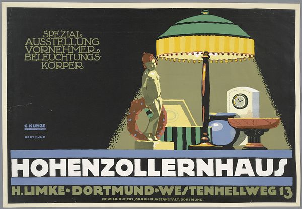
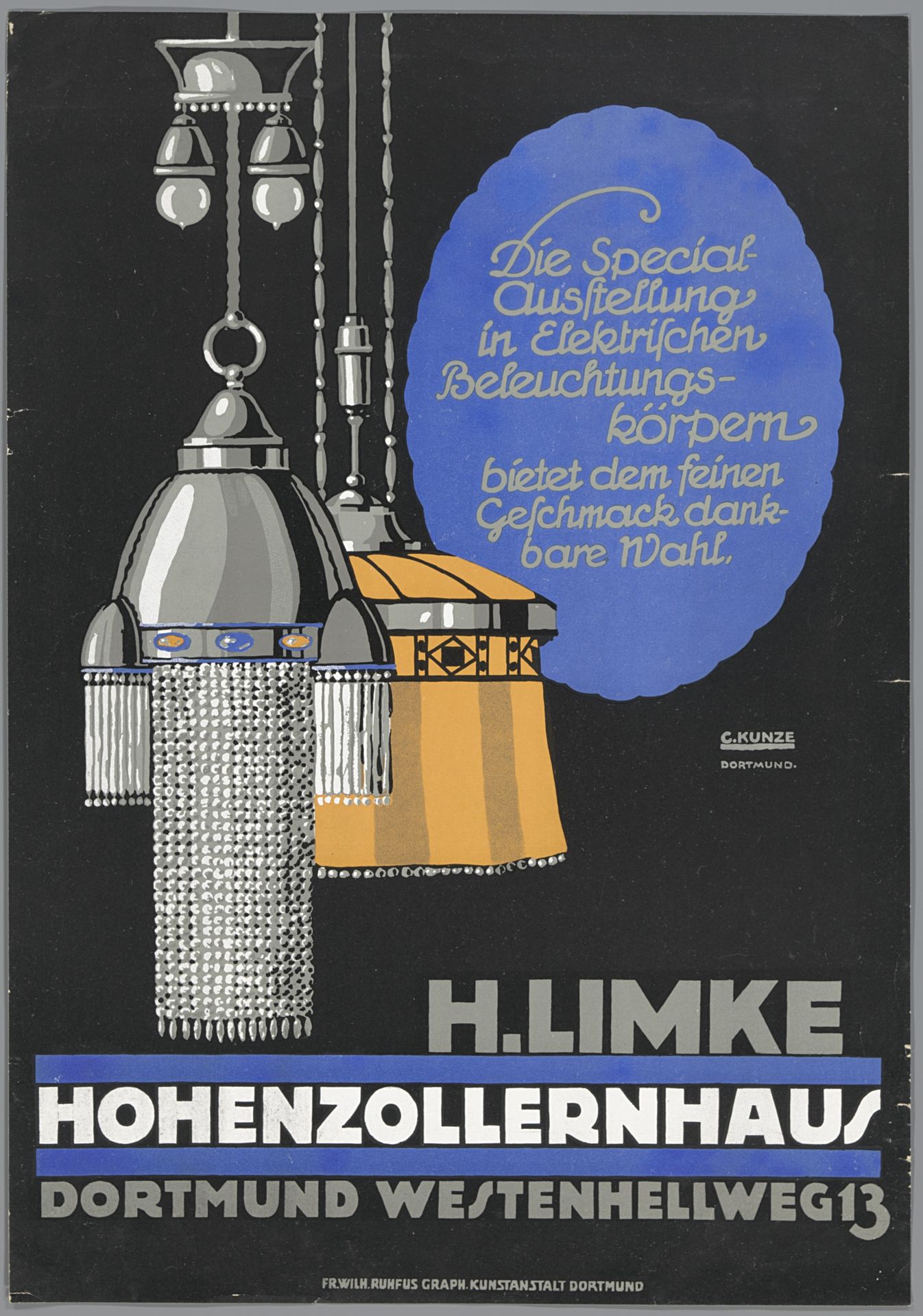
Curator: Let's focus our attention on this advertising poster titled "Die Special-Ausstellung in Elektrischen Beleuchtungskörpern...H. Limke. Hohenzollernhaus. Dortmund," dating from around 1910 to 1915 and attributed to Carl Kunze. It's a striking piece. Editor: My first thought? Sophisticated darkness. The stark contrast makes those hanging lamps positively glow. And the typography has a certain, almost dreamy flow to it. Like peering into a well-lit salon from a shadowed street. Curator: Exactly! Lighting itself is presented as a symbol of progress and taste. Electrical lamps, relatively new at the time, weren't just functional, they were aspirational. The phrase “bietet dem feinen Geschmack dankbare Wahl” translates to offering a "grateful choice to fine taste". It reflects a culture where commodities promised refinement. Editor: And there's that dreamy quality again—taste as gratitude. It's so perfectly turn-of-the-century bourgeois. I wonder what the artist, Carl Kunze, was trying to express about modernity in such a space? The geometric detailing combined with those heavy, draped fringes… Curator: It could symbolize the fusion of practicality and beauty, with Art Nouveau being embraced commercially. Consider also how typography emphasizes Hohenzollernhaus, evoking a sense of aristocratic prestige and embedding the lighting store in a culturally esteemed context. It subtly communicates value through association. Editor: Hmmm, the Hohenzollern… yeah. Makes me think about status, like a theatre of wealth on display. Maybe people felt like stage actors stepping into these showrooms to find their perfect light to step into, if that makes sense. I think they're tapping into not just style and progress but people’s deep wants for approval. Curator: Certainly, it seems intended to cast electrical lighting within an aura of aspiration. Even those pendant fixtures—heavy with Art Nouveau motifs—transform functionality into something profoundly symbolic, echoing desires woven deep within early 20th-century consumer culture. Editor: What's intriguing is seeing this advertisement not just as a sale, but as a slice of cultural theater that whispers desires louder than shouts. Makes me wonder what anxieties—around darkness, backwardness—it’s working to chase away. I'll look at electrical shops in a completely new way.
Die Special-Ausstellung in Elektrischen Beleuchtungskörpern (...) H. Limke. Hohenzollernhaus. Dortmund
c. 1910 - 1915
Artwork details
- Medium
- graphic-art, typography, poster
- Dimensions
- height 480 mm, width 335 mm
- Copyright
- Rijks Museum: Open Domain
Tags
Comments
Share your thoughts
About this artwork
Curator: Let's focus our attention on this advertising poster titled "Die Special-Ausstellung in Elektrischen Beleuchtungskörpern...H. Limke. Hohenzollernhaus. Dortmund," dating from around 1910 to 1915 and attributed to Carl Kunze. It's a striking piece. Editor: My first thought? Sophisticated darkness. The stark contrast makes those hanging lamps positively glow. And the typography has a certain, almost dreamy flow to it. Like peering into a well-lit salon from a shadowed street. Curator: Exactly! Lighting itself is presented as a symbol of progress and taste. Electrical lamps, relatively new at the time, weren't just functional, they were aspirational. The phrase “bietet dem feinen Geschmack dankbare Wahl” translates to offering a "grateful choice to fine taste". It reflects a culture where commodities promised refinement. Editor: And there's that dreamy quality again—taste as gratitude. It's so perfectly turn-of-the-century bourgeois. I wonder what the artist, Carl Kunze, was trying to express about modernity in such a space? The geometric detailing combined with those heavy, draped fringes… Curator: It could symbolize the fusion of practicality and beauty, with Art Nouveau being embraced commercially. Consider also how typography emphasizes Hohenzollernhaus, evoking a sense of aristocratic prestige and embedding the lighting store in a culturally esteemed context. It subtly communicates value through association. Editor: Hmmm, the Hohenzollern… yeah. Makes me think about status, like a theatre of wealth on display. Maybe people felt like stage actors stepping into these showrooms to find their perfect light to step into, if that makes sense. I think they're tapping into not just style and progress but people’s deep wants for approval. Curator: Certainly, it seems intended to cast electrical lighting within an aura of aspiration. Even those pendant fixtures—heavy with Art Nouveau motifs—transform functionality into something profoundly symbolic, echoing desires woven deep within early 20th-century consumer culture. Editor: What's intriguing is seeing this advertisement not just as a sale, but as a slice of cultural theater that whispers desires louder than shouts. Makes me wonder what anxieties—around darkness, backwardness—it’s working to chase away. I'll look at electrical shops in a completely new way.
Comments
Share your thoughts