drawing, print, ink
#
drawing
#
art-nouveau
# print
#
ink
#
geometric
Copyright: Public domain
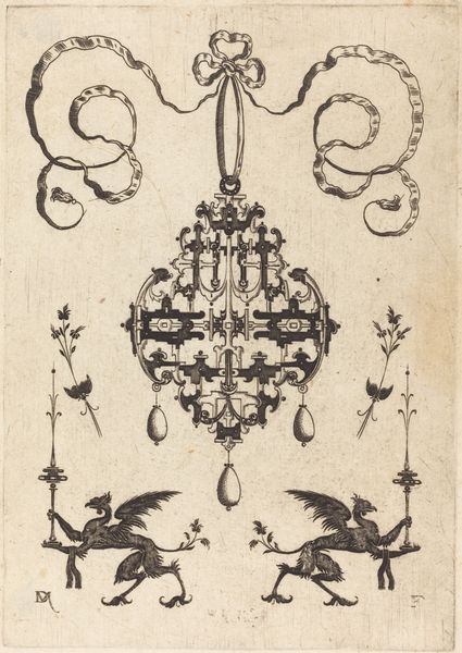
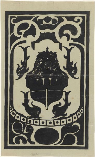
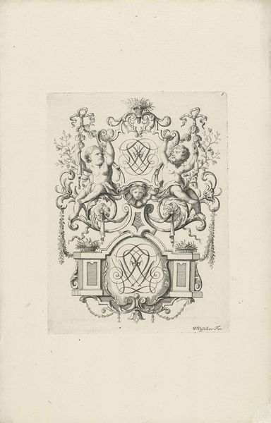
Editor: This is Józef Mehoffer’s “Lantern,” created around 1902. It’s an ink drawing or print, and it strikes me as simultaneously beautiful and kind of eerie. The detail is incredible, and the moth-like insects add a strange, almost unsettling, touch. What do you see in this piece? Curator: I'm immediately drawn to the lantern itself. Light is a potent symbol; it chases away darkness, represents knowledge, guidance. But a lantern is more than just a source of illumination. Consider its placement: it's suspended, suggesting both accessibility and a certain distance. It also frames and focuses the light. Editor: That’s interesting. So the lantern's design, all those swirling patterns, even those moths…they’re all significant? Curator: Precisely! Think about moths drawn to a flame. They are often associated with transformation, but also self-destruction in their relentless pursuit. And note how the lantern is adorned. The stylized leaves recall nature, fertility perhaps, while the geometric facets capture and refract the light. It becomes a vessel containing both promise and peril. What do you make of its ornamentation and rigid, geometric panes combined in one object? Editor: It's like it's both organic and controlled. I guess I assumed the ornamentation was just decoration in that Art Nouveau style. Curator: And what does Art Nouveau mean to you? How do you perceive its aesthetic within the era? Editor: I always thought the style references a longing for an imagined, ornamented past, but seeing the Art Nouveau elements with these rigid, controlled shapes definitely presents a duality in this design. The light it would give off is almost secondary. Curator: You are correct. This resonates across decades. And look how those symbols and geometric shapes convey emotional, cultural, and psychological states as an aesthetic ideal! Now, how might one think about historical context relating to personal ideas here? Editor: I never thought a lantern could contain so many layers! Looking at it this way really opens my eyes to the artist’s cultural understanding, as you mentioned. I was so focused on just its design at first! Curator: Indeed. Seeing the continuities of visual language enables you to go beyond personal impressions of individual symbols or isolated cultural associations, to broader meanings and impacts over time. This design's purpose extends beyond illumination, encompassing the rich history and culture behind each decision.
Comments
No comments
Be the first to comment and join the conversation on the ultimate creative platform.
More like this