graphic-art, print, poster
sport poster
advert image
art-deco
graphic-art
magazine cover layout
magazine cover
digital magazine
advert design
film poster
advertisement layout
geometric
magazine layout
cityscape
print advert
poster
Copyright: Cassandre,Fair Use
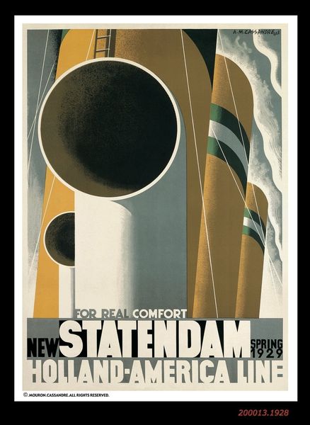
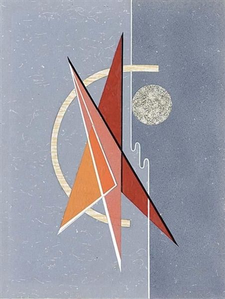
Cassandre made this poster, Chemin De Fer Du Nord, around 1929, and what strikes me is the almost brutal way he simplifies form. It feels very modern, very purposeful. You get the sense that every line, every color, is there for a reason. I love how the gold circle sits, almost smugly, amidst the grays and blues, becoming a kind of sun. The surface of the object is mostly flat and opaque, but the gradients are so smooth and subtle. It's almost as if he's trying to hide the work involved, but you can see the faint textures where the black pigment bleeds into white. Looking at this, I can’t help but think of Stuart Davis, especially in the way he uses geometric shapes to create a sense of depth and movement. But unlike Davis, Cassandre here is all about efficiency. It’s advertising after all, and it’s about speed, luxury, and comfort, not the complexities of the human condition. Or is it? Maybe I’m overthinking. That's what art is for, right?
Comments
No comments
Be the first to comment and join the conversation on the ultimate creative platform.