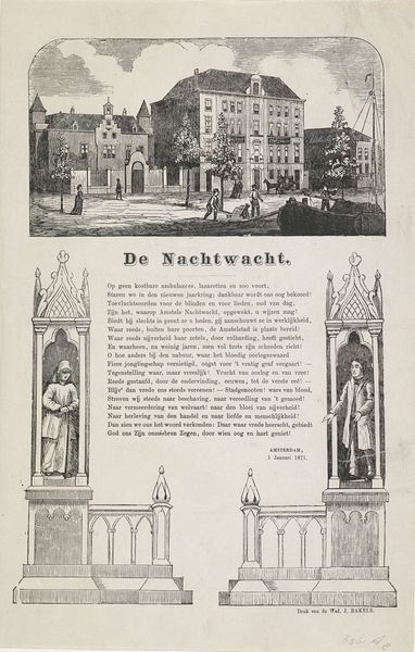
graphic-art, print, engraving, architecture
graphic-art
old engraving style
architecture drawing
cityscape
engraving
architecture
Dimensions: height 307 mm, width 215 mm
Copyright: Rijks Museum: Open Domain
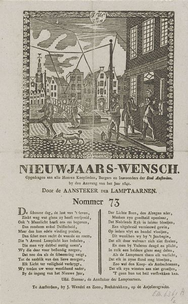
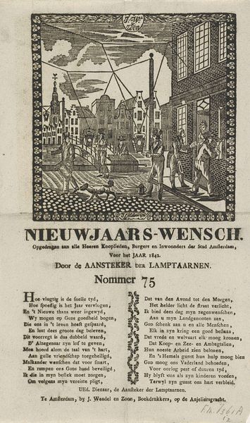
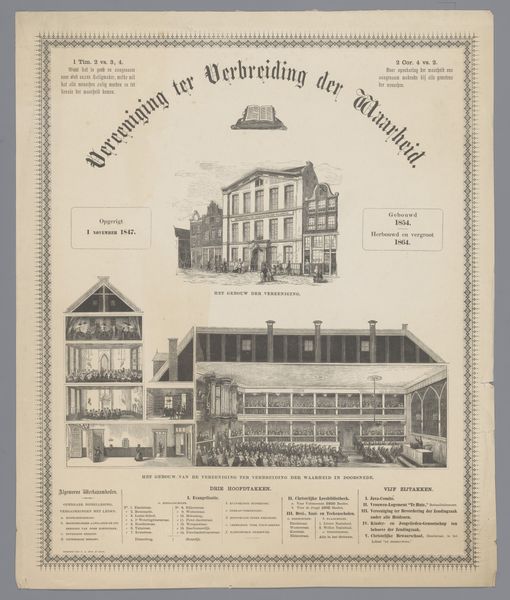
Editor: This engraving, "Kermisprent van de Amsterdamse nachtwacht voor het jaar 1869," from 1869, presents an interesting city scene. I’m immediately drawn to the symmetry and the stark contrast between the detailed cityscape above and the highly stylized text and heraldic shields below. What do you see as its most striking qualities? Curator: The strength of this print lies in its formal arrangement. Notice how the upper register, with the architectural rendering, visually contrasts the structured, almost rigid, design of the lower portion with the text and heraldry. It employs linear precision— the lines define the forms and spatial relationships, creating depth in the cityscape and flat, symbolic representation in the lower panel. Editor: So the contrast between the lively architecture and the flatter elements is key? Curator: Precisely. Look at the texture achieved solely through line variation in the buildings, versus the more static use of line to delineate the shields. Semiotically, what do the shields signify in contrast to the implied hustle and bustle depicted in the upper part? What could these contrasts infer, especially when presented alongside bold, assertive text? How does its textual components affect its aesthetic properties? Editor: Perhaps it speaks to the relationship between civic pride, symbolized by the heraldry, and the actual lived experience of the city dwellers? Curator: An interesting observation! The piece seems conscious of its own construction. It emphasizes line, form, and organization to convey its message and, it seems, create visual impact and draw us in. It makes me curious about the cultural context of integrating text as part of the compositional element as a way of conveying meaning during this period. Editor: This emphasis on structure and arrangement has really reshaped my perspective. I’m starting to appreciate the deliberate choices behind what I initially perceived as simply a decorative print. Curator: Indeed, examining its intrinsic visual qualities provides access to rich and interesting insight.
Comments
No comments
Be the first to comment and join the conversation on the ultimate creative platform.
More like this