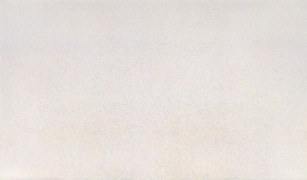
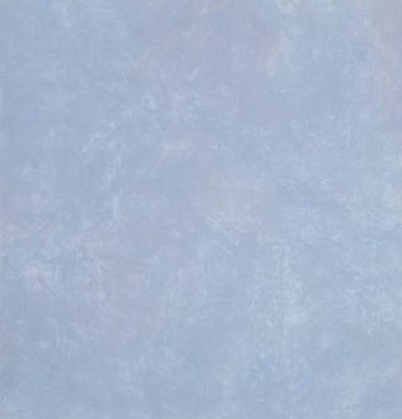
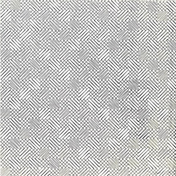
Painting No. 02–25 (Cobalt Violet, Lemon Yellow, Cobalt Green Dark) (detail) 2002
0:00
0:00
acrylic-paint
#
random pattern
#
acrylic-paint
#
abstract pattern
#
matter-painting
#
repetition of pattern
#
vertical pattern
#
abstraction
#
regular pattern
#
pattern repetition
#
textile design
#
imprinted textile
#
layered pattern
#
funky pattern
#
monochrome
Copyright: Rudolf de Crignis,Fair Use
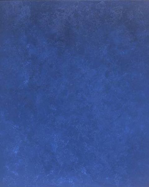
Curator: What a fascinating piece! We're looking at a detail from Rudolf de Crignis's "Painting No. 02–25 (Cobalt Violet, Lemon Yellow, Cobalt Green Dark)" created in 2002 using acrylic paint. Editor: At first glance, it appears to be a solid field of pastel blue. Almost like raw denim before the distressing, if that makes sense. It looks…uniformly textured. Curator: Yes, but on closer inspection, there's so much more than meets the eye. Consider this work within the lineage of monochrome painting, a space that’s frequently fraught with notions of masculine artistic genius. How does this composition challenge those pre-existing narratives, considering its subtle variances in tone and pattern? Editor: It feels like a deconstruction, perhaps, of the very idea of monochrome. De Crignis gives us this field of colour but subtly introduces elements of disruption through texture and tone. Given the title, were these the colours all originally separate, unified here? The detail offers very little information about the total canvas. How does the whole participate within debates around abstraction, or is it perhaps matter painting? Curator: Absolutely. Matter painting as a framework asks us to contemplate the very substance of paint and the act of applying it. Furthermore, if we read "Painting No. 02-25" as a form of textile or surface design, as it evokes, the ready-made implications disrupt a singular patriarchal vision. What might it suggest if we expand on ideas of “decoration," and its position within both a capitalist art market, or worse, against the loaded polemic, of kitsch? Editor: Fascinating. Considering his output and engagement with surface textures, is there something here too, of challenging institutional power in art? Abstract and subtle pieces like this often are either canonised and accepted or dismissed as naive decoration, a conversation always politically loaded with how art, especially like this painting, functions as a social marker. Curator: Precisely. His work really embodies this dialogue between high art and these "lesser" associations that continue to frame both abstraction, or perhaps deceptively flatten even art history itself. Editor: So, this deceivingly flat looking piece invites a myriad of questions about value, perception, and historical baggage, all swirling beneath its serene, blue surface. Curator: Exactly. It demands that we consider our own ingrained assumptions about art and its role in society, even down to surface appearance and simple materials.
Comments
No comments
Be the first to comment and join the conversation on the ultimate creative platform.
More like this