drawing, graphic-art, ink, pen
#
drawing
#
graphic-art
#
comic strip sketch
#
ink drawing
#
narrative-art
#
pen illustration
#
pen sketch
#
junji ito style
#
figuration
#
ink line art
#
linework heavy
#
ink
#
ink drawing experimentation
#
pen-ink sketch
#
expressionism
#
pen work
#
russian-avant-garde
#
pen
#
monochrome
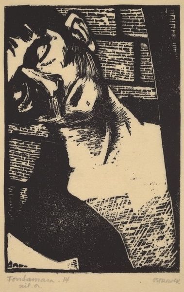
Copyright: Public domain US
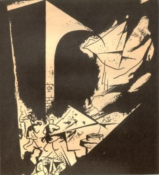
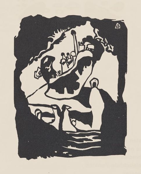
Jury Annenkov made this illustration to Aleksander Blok's poem 'The Twelve' using what looks like ink and paper to create a world of stark contrasts. The piece is mostly monochromatic, with the solid blacks and thin, scratchy lines, establishing the image with clarity and simplicity. It's like he's making it up as he goes, deciding as he fills in which parts stay light and which go dark. You can see how the thick, pooling ink forms the looming silhouette that dominates the scene, and the fine linework details the chaotic urban landscape around it. I like how the stark contrast heightens the emotional tension, reflecting the revolutionary fervor of the poem. The way that the image combines abstraction and representation reminds me a bit of some early Dadaist stuff, like maybe Hannah Höch. Though Annenkov's focus on narrative and character feels very distinctly Russian. It's a conversation across borders and art forms.
Comments
No comments
Be the first to comment and join the conversation on the ultimate creative platform.
More like this